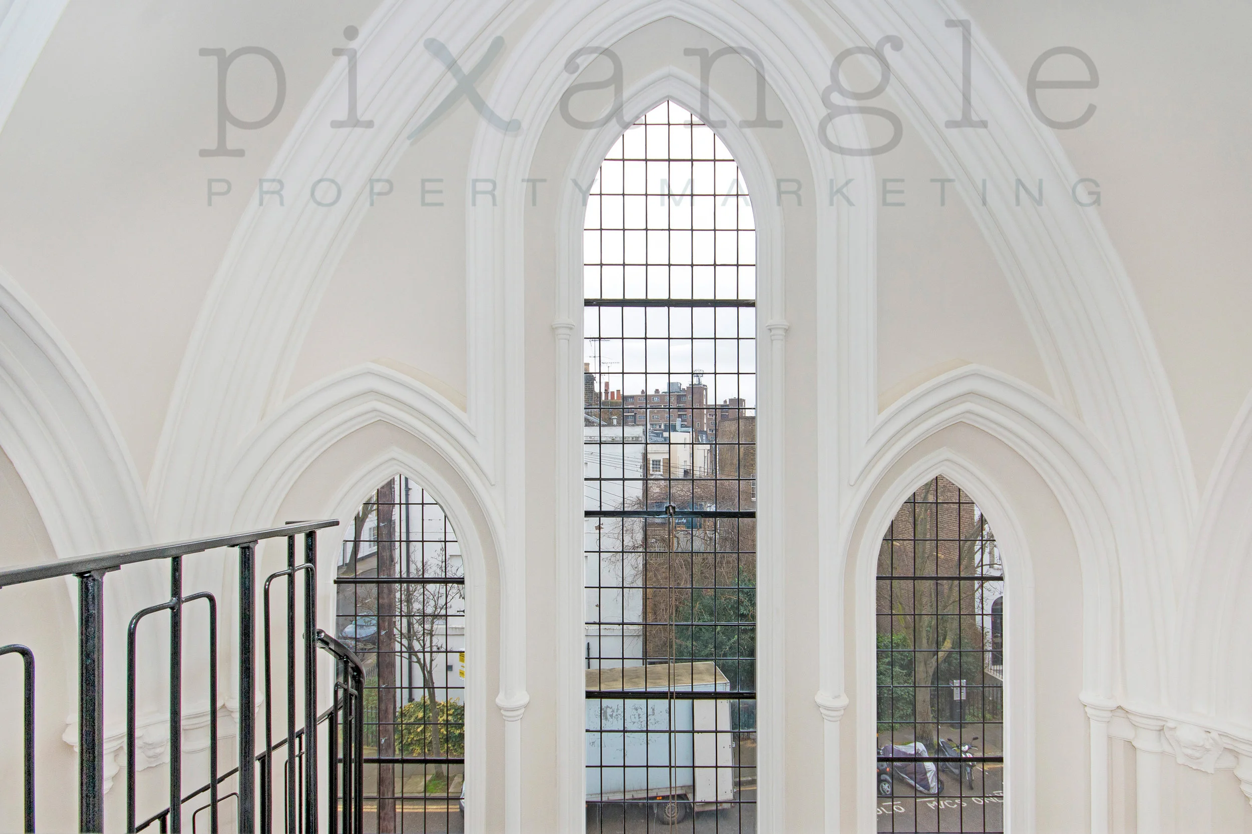
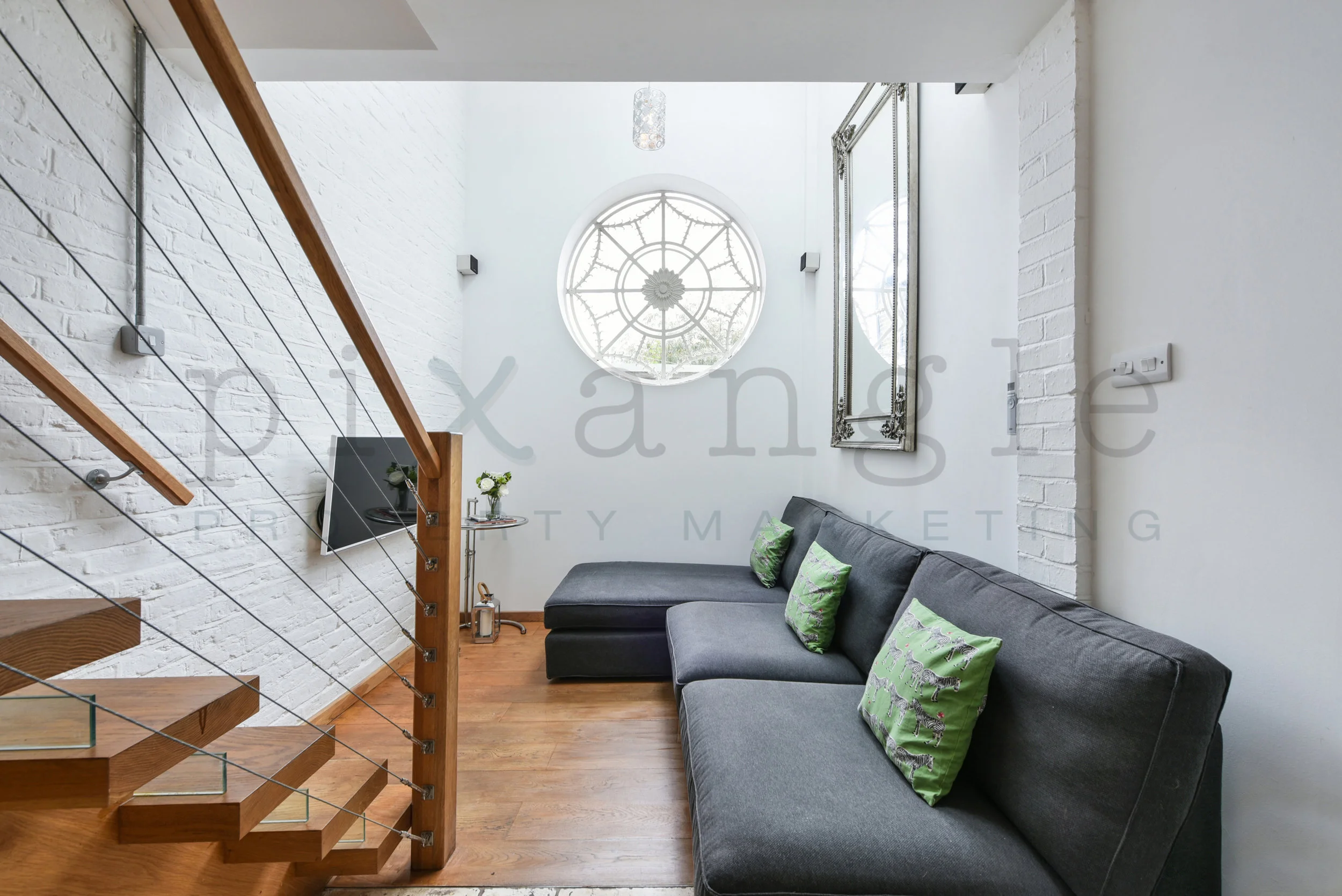
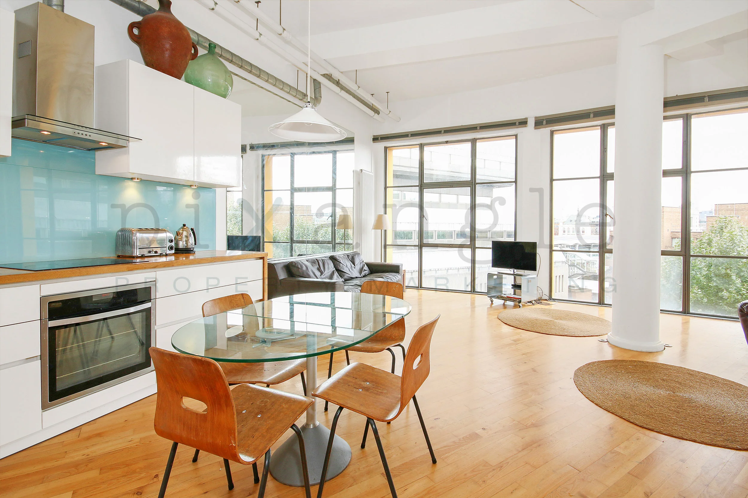
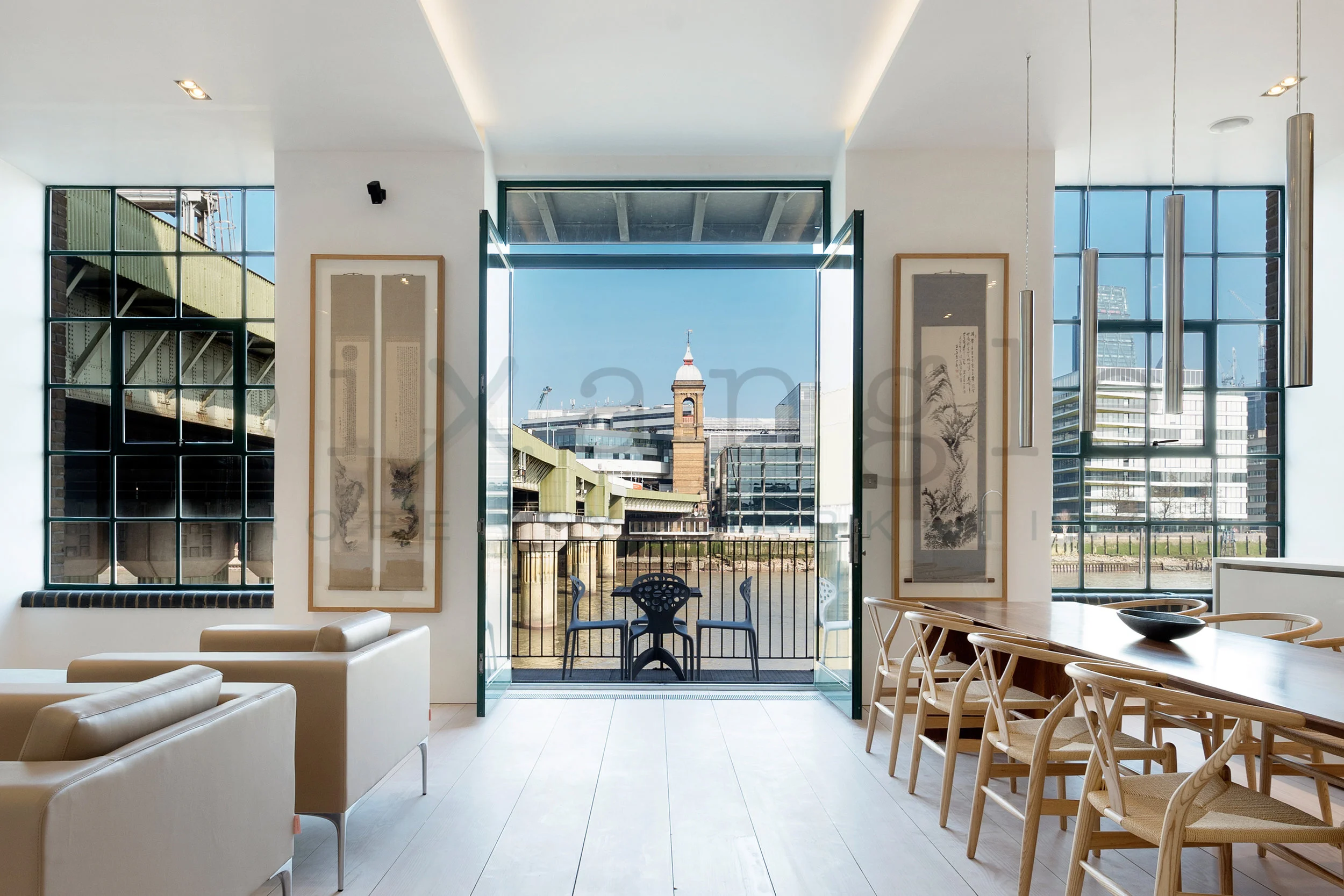
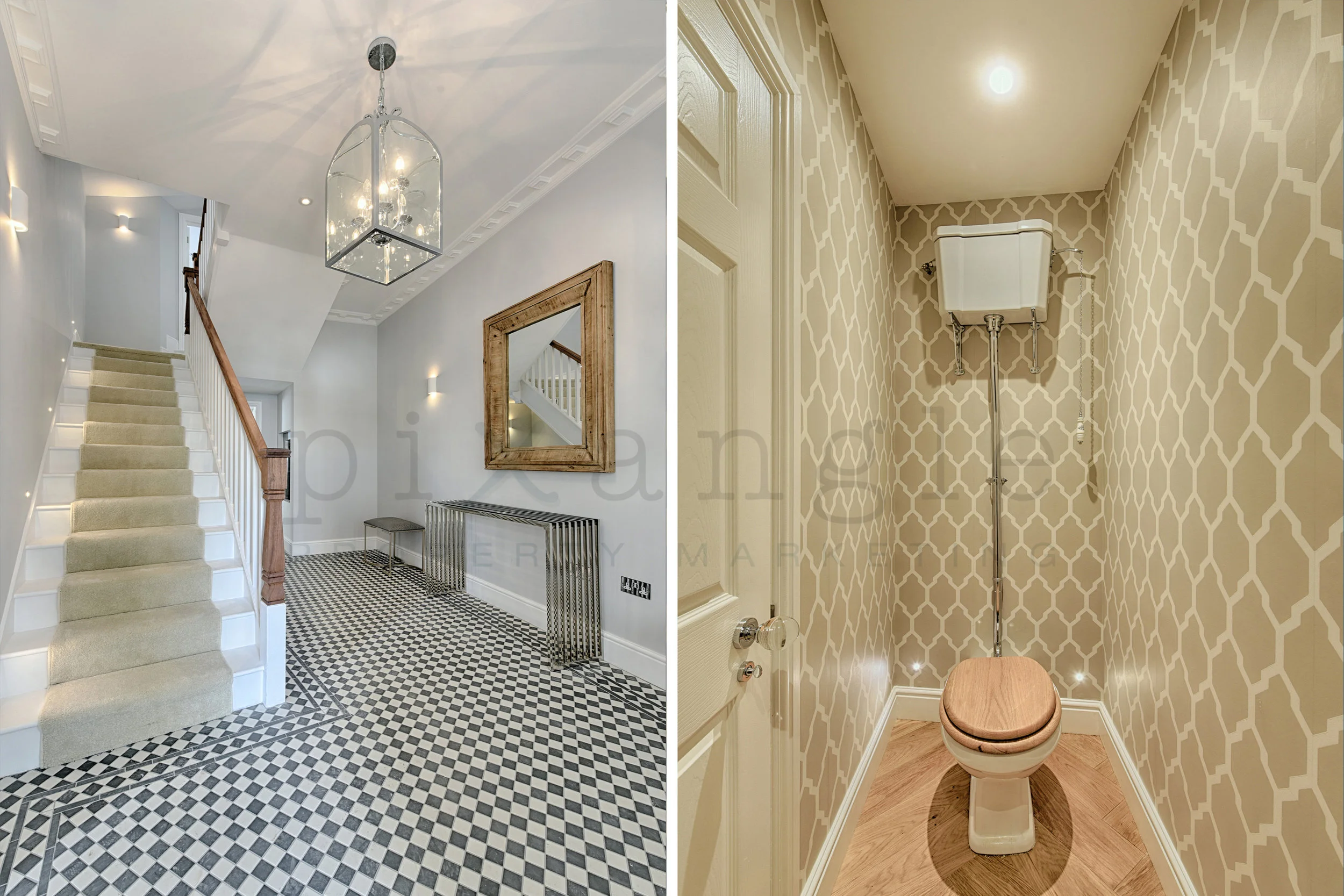
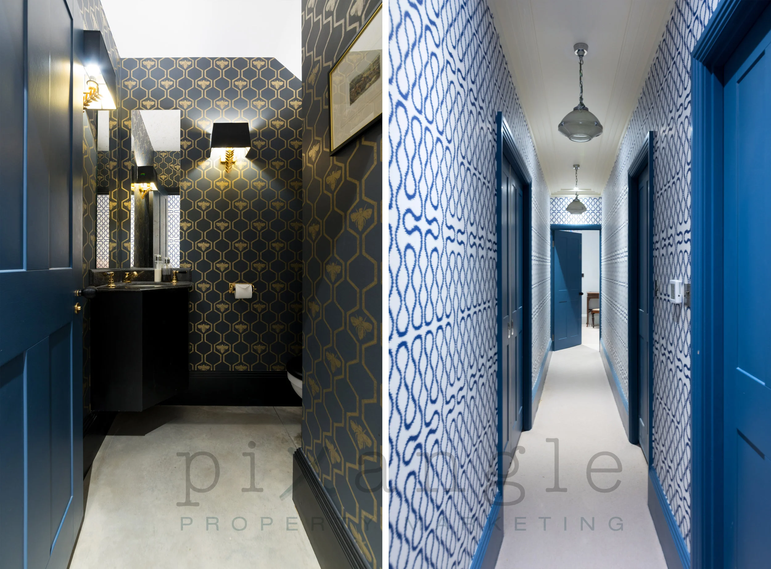
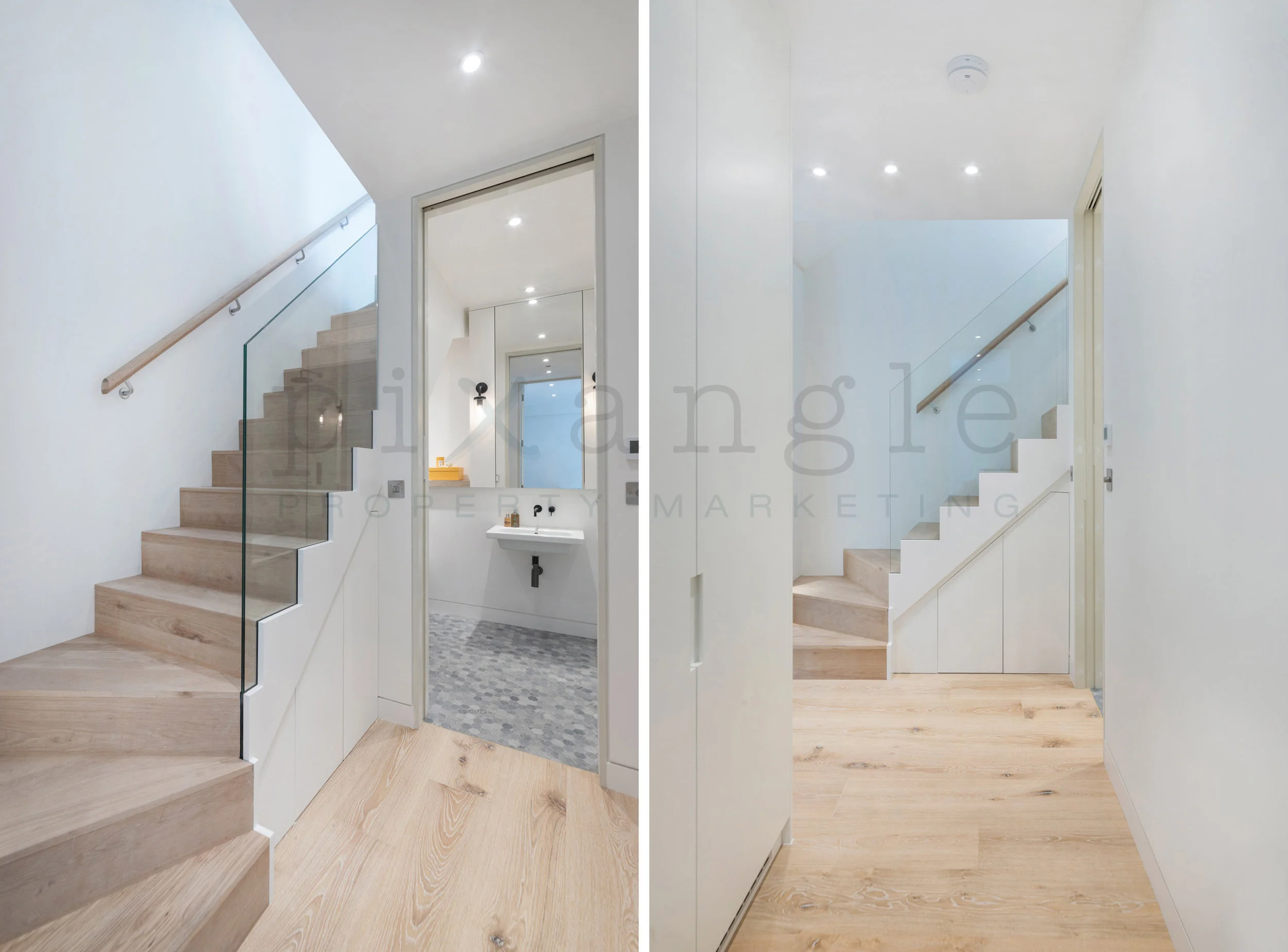
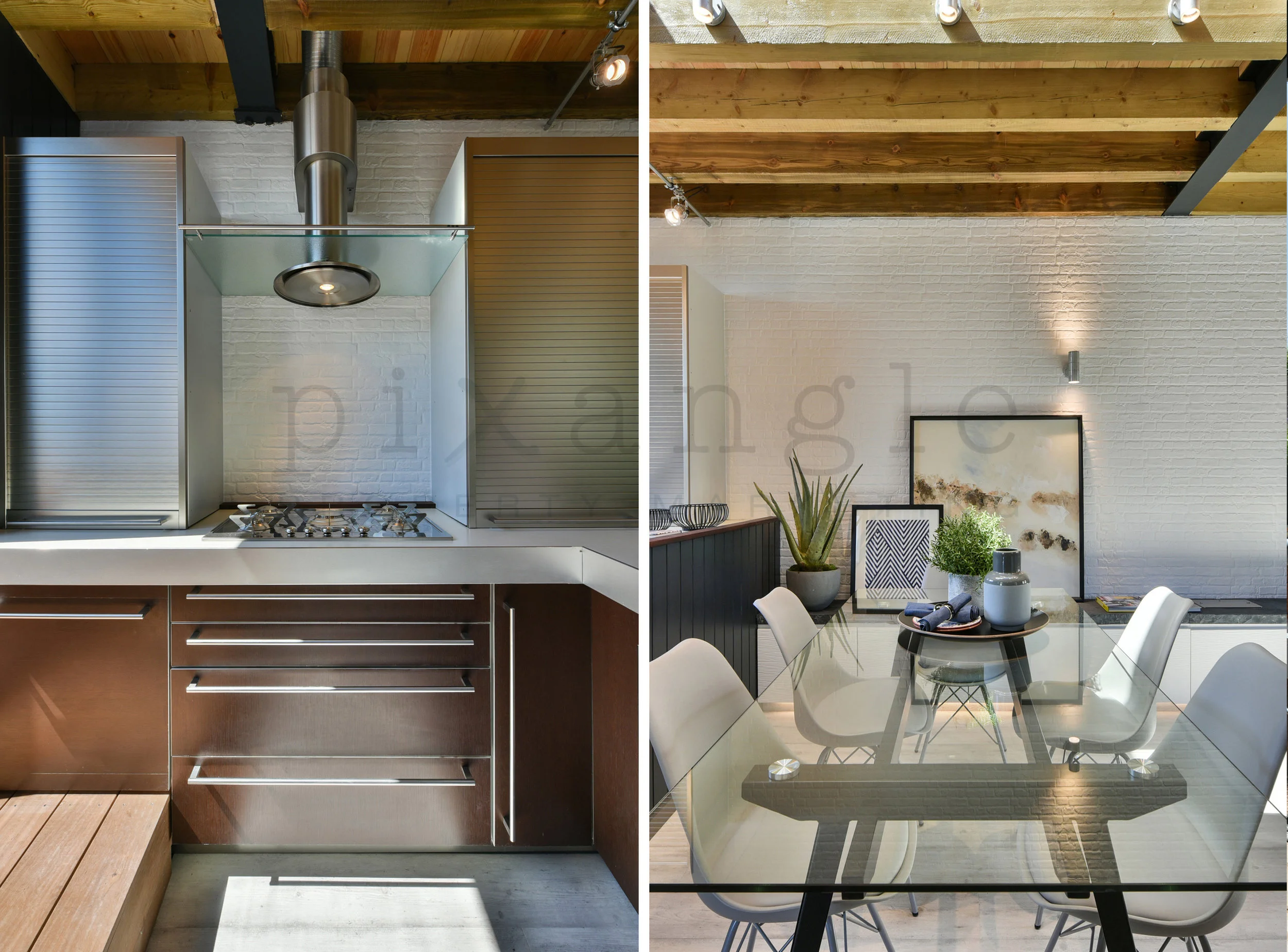
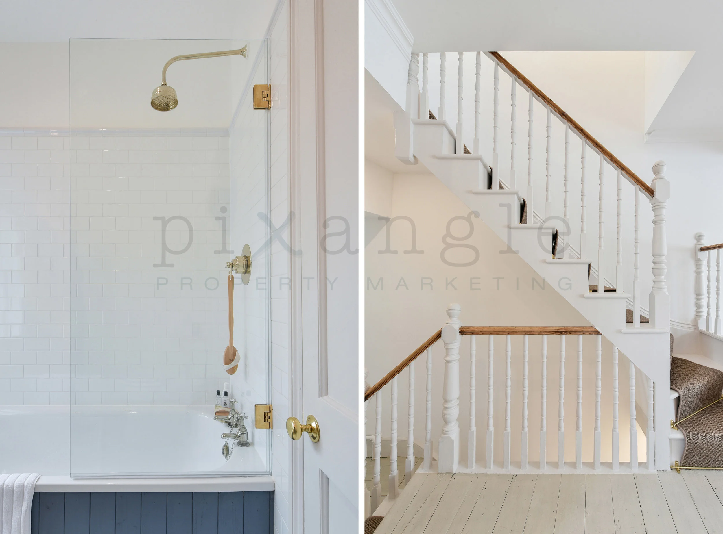
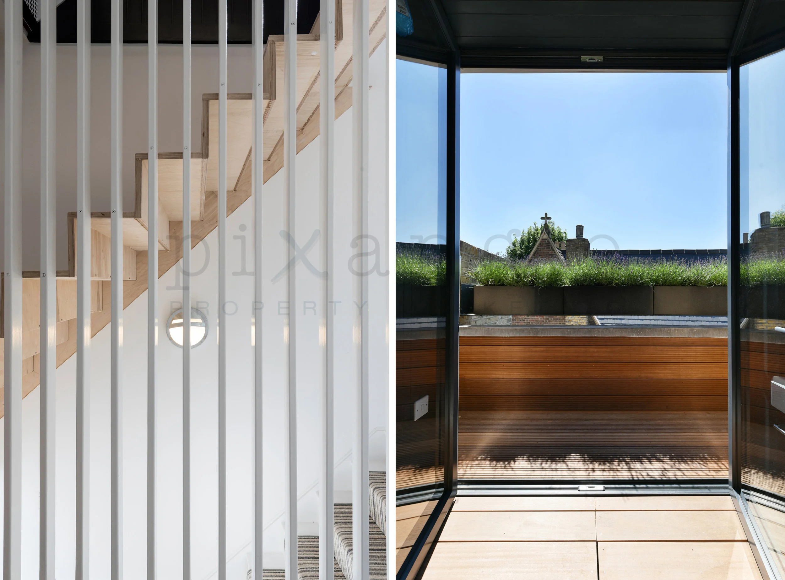
We generally find that the most popular image orientation for property photography is landscape: It lends itself to showing off breadth of rooms and the scope of interior space. We also find that many web platforms tend to prefer it. This means, however, that sometimes we can miss out on shots that lend themselves to portrait: namely corridors, stairways or narrow spaces.
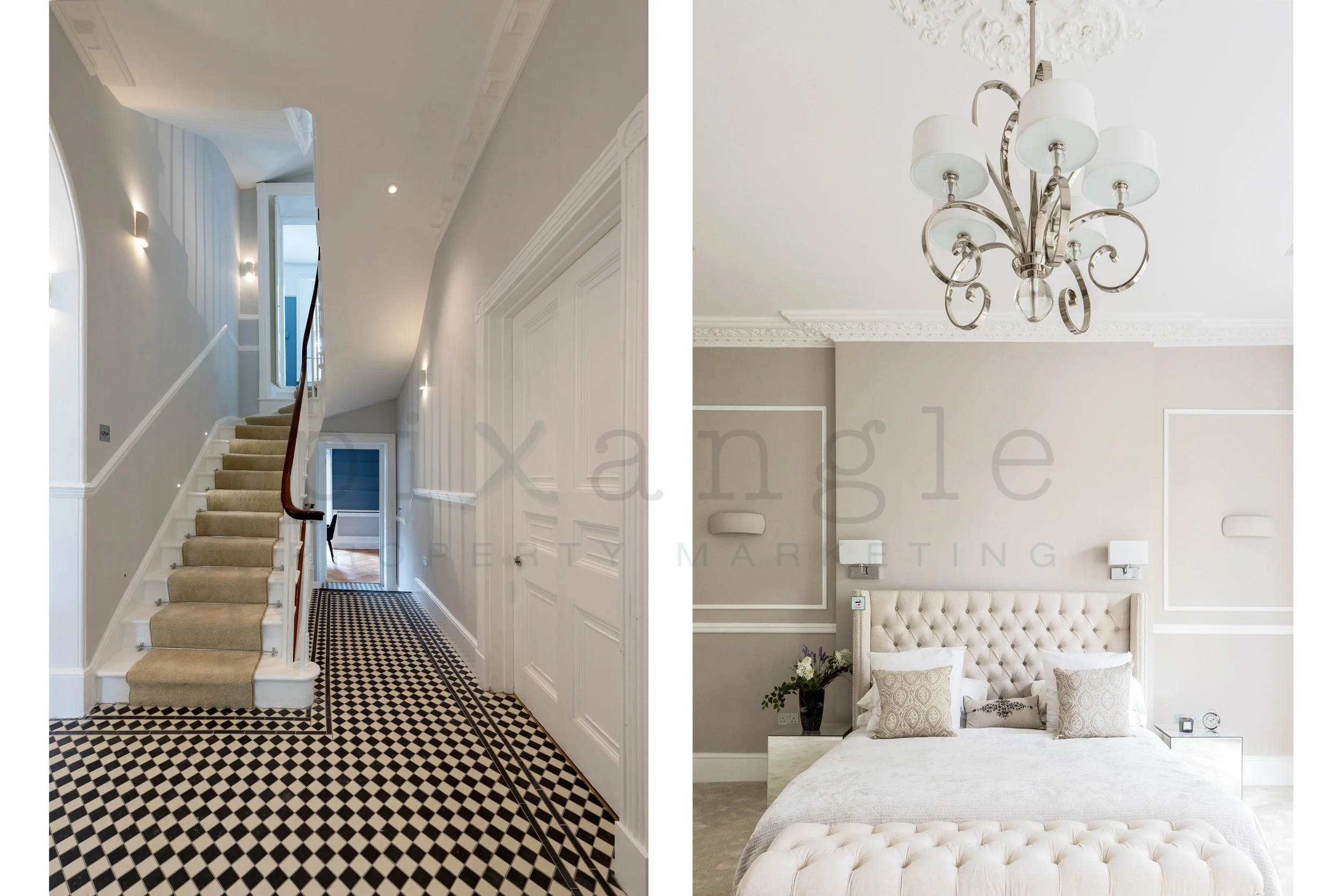
So we've recently got around this by introducing our split-screen shots: Two portrait photos placed side by side to create a landscape-sized image, but allowing us to show off every aspect of the property. A nice side effect of this is how aesthetically pleasing two images can look next to each other, especially when they either match or deliberately contrast in some way.
Here are some of our favourite split-screen shots from the last few months.
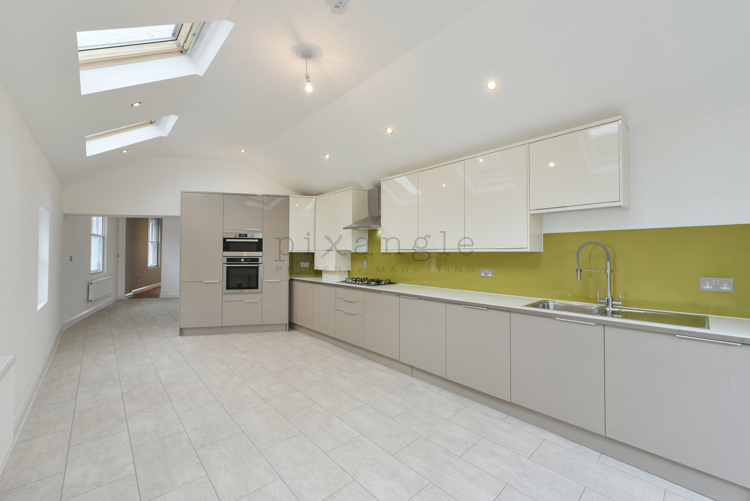
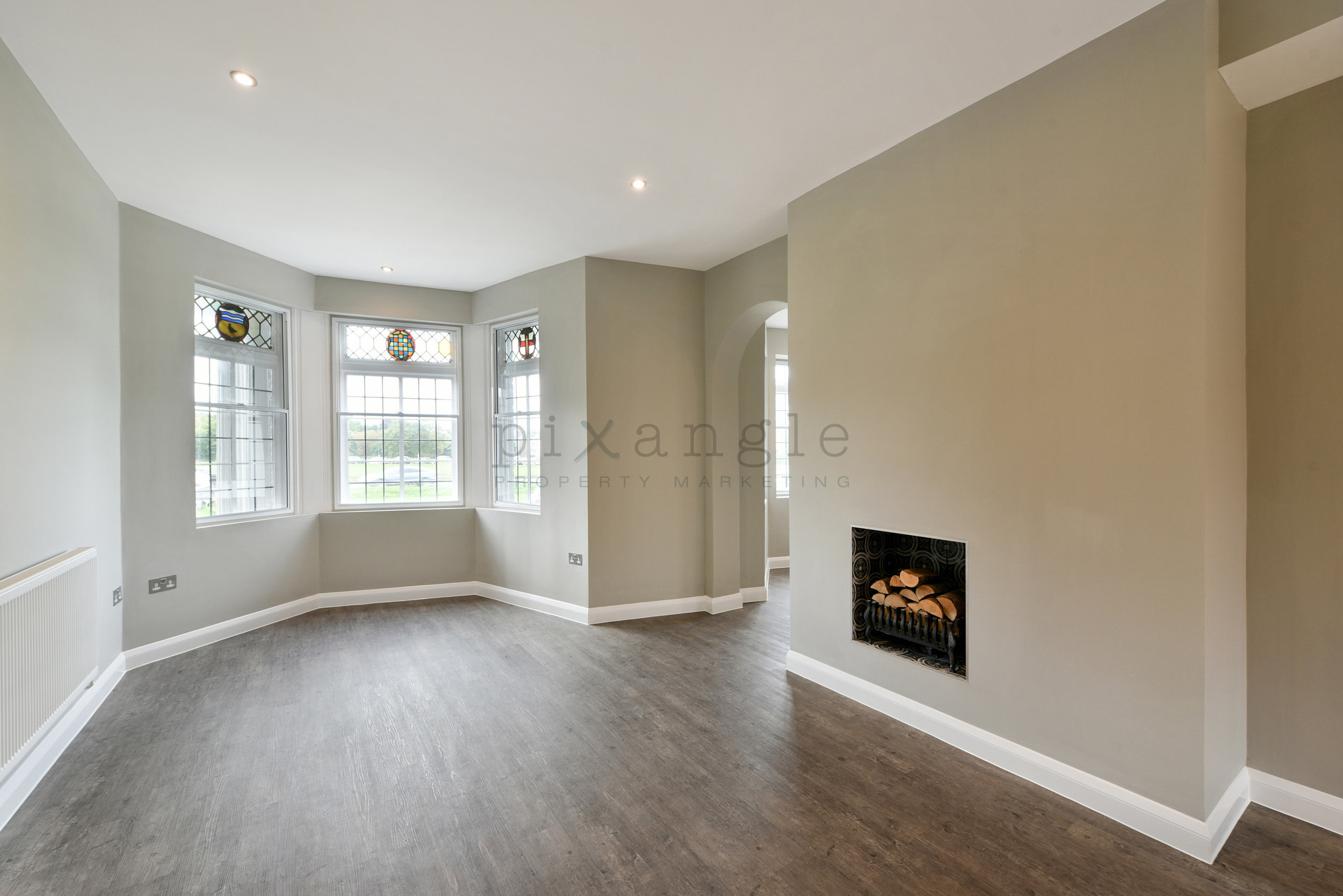
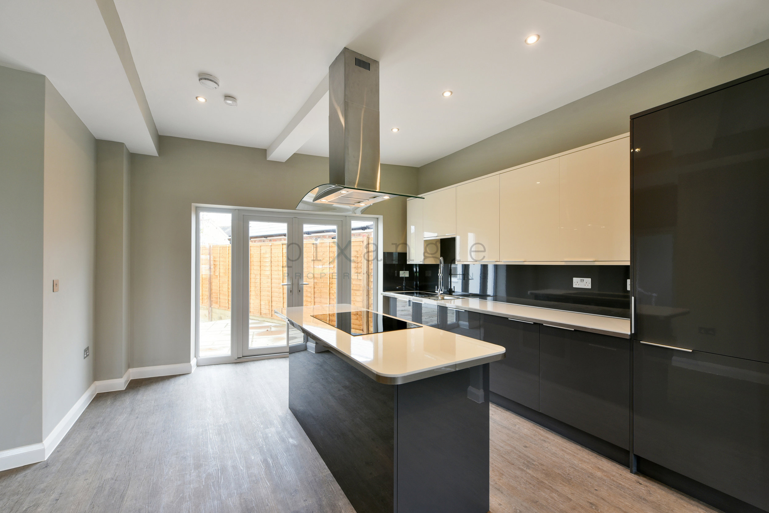
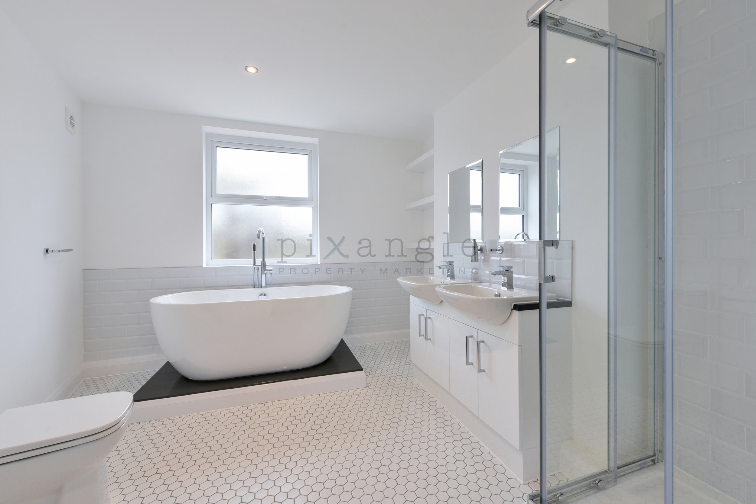
1. Ooooh, the serenity. A beautifully renovated and refurbed house, this place had such beautiful interior design and decor, thanks to The Haywoods Group, that there were plenty of opportunities for feature shots. Of course we needed to show off those gorgeous floor tiles, but the portrait nature of the shot on the right meant we were able to show both the bed, and how well the light fitting and its ceiling rose above complemented it.