Blog

Pixangle blog on our photography, floor plan and EPC experiences in London and the South East

Our Latest Virtual Staging - Where Interior Design Meets Tech

We’ve been delighted to take on more virtual staging projects over the last year, and have been having fun exercising our interior design skills too.

There’s great tech for staging these days, but it’s not just about the software - we work hard to create a specific look for our staged images, with allowance for creative input from our clients and changes where necessary.

Virtual staging is a great way to add context to a room, inspiring potential buyers and renters and demonstrating how welcoming a property can look when fully furnished.

Let’s take a look at some of our latest work…

These images were virtually staged from our photography taken at a one bed flat in Balham, marketed by Credential. It’s a nicely done out flat with a neutral decor, but adding the furniture gives a much better idea of the space. Let’s take a closer look at the staged image:

We staged images of other spaces in the flat, to complete the full picture:

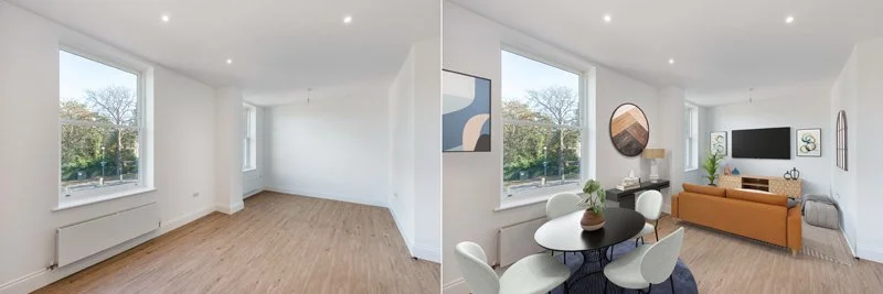
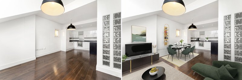
This was one of our favourite images as it shows how the open plan kitchen/living room can be used for living and dining, and how the furniture might be laid out to good effect.

And from the other angle, which shows the lovely dual aspect windows - nothing to do with us!

Next up is this flat in a period building on Copers Cope Road in Beckenham, marketed by Pedder New Homes. You can instantly see from this image how much the flat benefits from being virtually staged: even the beautiful large window looks far better when framed with curtains. Here’s a closer look at the finished product:

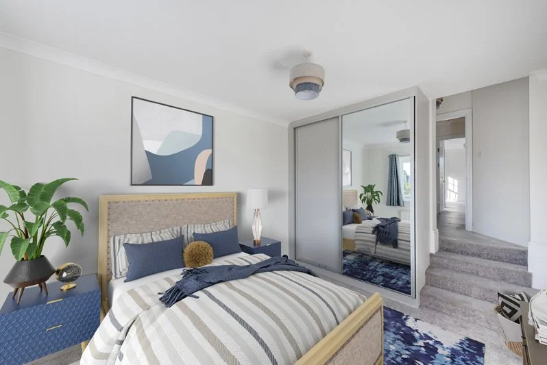
We’ve gone for a Modern Bohemian look here: plenty of hygge with warm light colours to maximise the space.

A similar but sleeker style for the kitchen/living room, with warm neutrals and plants to complement it.

And the reverse angle shows how the space can be neatly divided for separation of use.

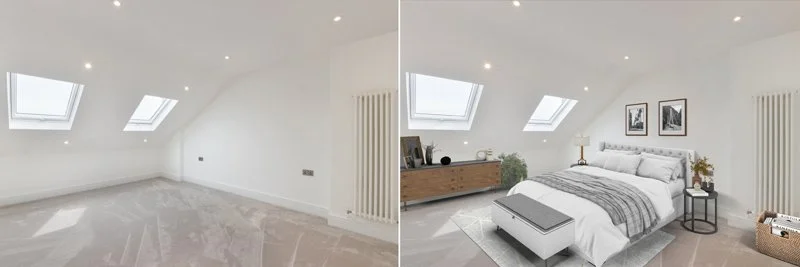
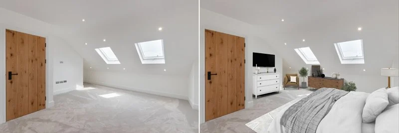
Loft conversions arguably benefit the most from virtual staging, as there can be a tendency to assume they are restrictively small spaces due to the reduced head height. This property was shot for the lovely people at Winkworth in Tooting, after a refurb.

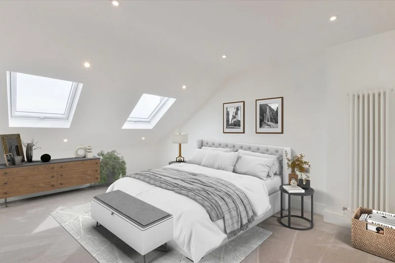
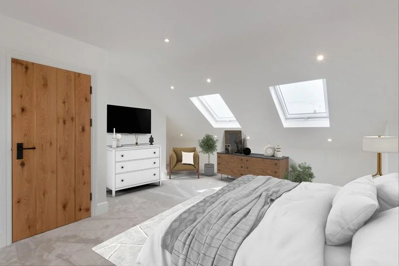
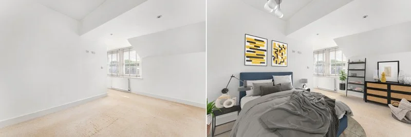
Staging an empty loft conversion demonstrates that this is not necessarily so - have a closer look at the furniture choices used here which make the most of the space:

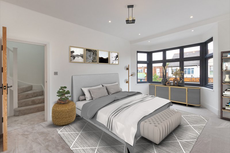
Here we can see the reverse angle of the room, and the close up:

Furniture choices are based on space available so we are always giving a realistic representation of how a room can be furnished.

The rest of the property also got the virtual staging treatment with a modern deco vibe!

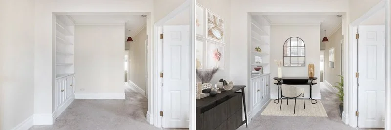
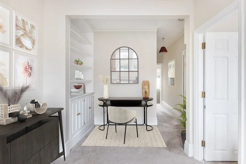
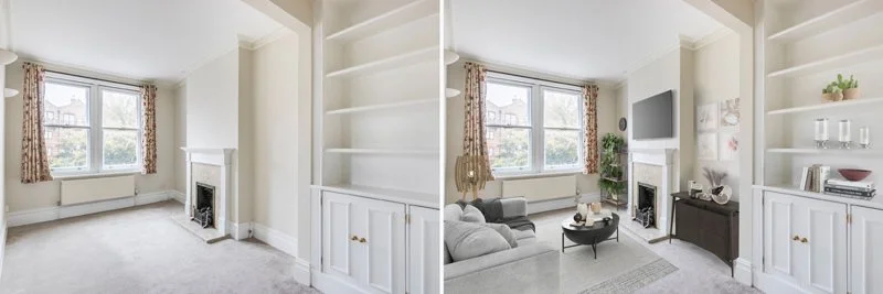
This is one of our favourite examples of how virtual staging can be effective: just look at the difference between the before and after shots. In a furnished property, this angle would constitute a feature shot in a photography shoot; without furniture it’s just another corner of a room, though beautifully composed.

Let’s look closer at the furniture placement:

A space defined by its proximity to a corridor has been reshaped by the placement of desk, which works really well with the inbuilt shelves adjacent.

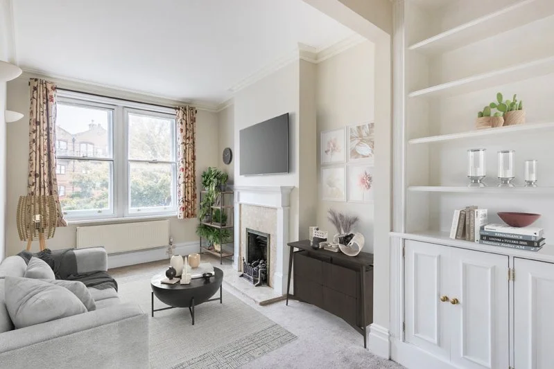
Taking a look at the reverse angle, we can see that we’ve used a traditional look for this period property, and made it both elegant and homely.

This property is marketed by Pim Assen for Keller Williams, and is located in Barnes.

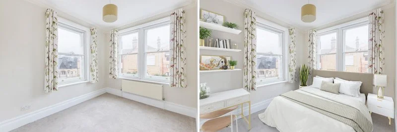
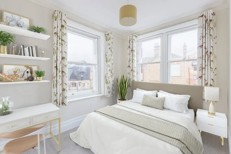
Here a bedroom is brought to life with decor chosen to blend in with the existing curtains as well as the light neutral colours of the property. Here’s a better look:

And finally we have a quirky apartment which we staged for Location Location, working around design features in the build and complementing the period.

As you can see, the space is big and bright enough to support darker furniture and a sleek look.

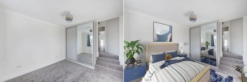
The existing shot of the bedroom is entirely white with a neutral carpet, giving little idea of how the space can be made into a home. Bright prints enliven the area, and we’ve gone for a quite artistic vibe. Have a closer look:

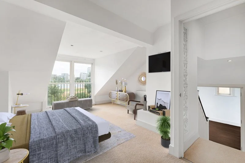
The second bedroom here is a neater vibe, so as not to detract from the large glazed doors to the Juliet balcony. We think this has more of a serene vibe, presided over by the green views!

If you’re interested in our virtual staging services, don’t hesitate to give us a call or send us an email; we’d be delighted to discuss your needs!

My EPC needs to be a 'C'? What do I do?

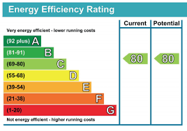
Over recent months, news of a proposed tightening of EPC rules in 2025 for lettings has caused many landlords concern, and that's not surprising. Out for consultation is a proposal to require any property that is let to have an EPC rating no lower than a C. Given that getting some of the country's older building stock to achieve the current stipulation of an E rating required significant remedial work, this poses a considerable problem.


The average property in England and Wales scores a D rating, and most Edwardian and Victorian properties only just achieve this, provided they have efficient condensing gas boilers as the source of heating.  


There is also a lot of talk about heat pumps being the natural replacement for a gas boiler. This technology, while not new, hasn't had widespread use in this country for heating homes with a wet radiator system. It is currently very expensive to install, there are no available grants at the moment, and there are still question marks over the efficiency and effectiveness of these systems for domestic use in the UK. 


Furthermore, as the current direction seems to be trending away from natural gas and towards electricity, homeowners would be forgiven for thinking that electricity as a source to heat your home will score well. Unfortunately, as things currently stand with EPCs, this is not the case. Confusingly, domestic EPCs are actually geared towards unit cost of fuel rather than CO2 output, and as electricity is more expensive than gas, the EPC rating will be low. 


So, what should you do now? 


Firstly you should bear in mind that the "C rating by 2025" is by no means set in stone. The proposed bill is in doubt after the tragic murder of MP David Amess. He was the bill's main sponsor and so far no one else has sponsored it. In any case, these bills are, apparently, more likely used to draw attention to a particular issue than to actually become law. 86% of homes in the UK currently use gas as a source of heating(1) and to replace this within the space of a few years would be a monumental task. It is very likely that 2025 will be deemed too soon. Even the government's previous energy white paper setting the target at 2030 is still a tall order.


Secondly, ask yourself: What you have already done to your property? Have you undertaken energy saving measures to date? Currently there is a ‘high cost’ exemption(2) if you can demonstrate that to take your property to an E rating would cost more than £3500. It is very likely that this exemption will remain in place in some form if the requirement rises to 'C'.


Thirdly, seek advice. There might be things you can change about your property that are not listed on the 'Recommended Measures' section of your EPC report. At Pixangle we offer a 'MEES' (Minimum Energy Efficiency Standards) service where we analyse ALL of the measures available to achieve a certain rating, and produce a report detailing your options.


It is clear that the direction of travel is towards creating a more energy efficient housing stock, and rightly so. Homes are estimated to account for 22% of the UK’s greenhouse gas emissions. The UK has set in law a target to bring its greenhouse gas emissions to net zero by 2050. But the way in which it is done needs to be realistic, affordable and achievable. 


https://www.statista.com/statistics/289137/central-heating-in-households-in-the-uk/

2 https://www.gov.uk/government/publications/private-rented-sector-minimum-energy-efficiency-standard-exemptions/guidance-on-prs-exemptions-and-exemptions-register-evidence-requirements

Beautiful Bathrooms - The Work of Belgravia Prestige

We have recently had the pleasure of working with Belgravia Prestige, capturing their immaculate work interior designing beautiful bathrooms. We’re delighted to share the results here, and show off these lovely spaces.

Birch House Ph1 logo.jpg

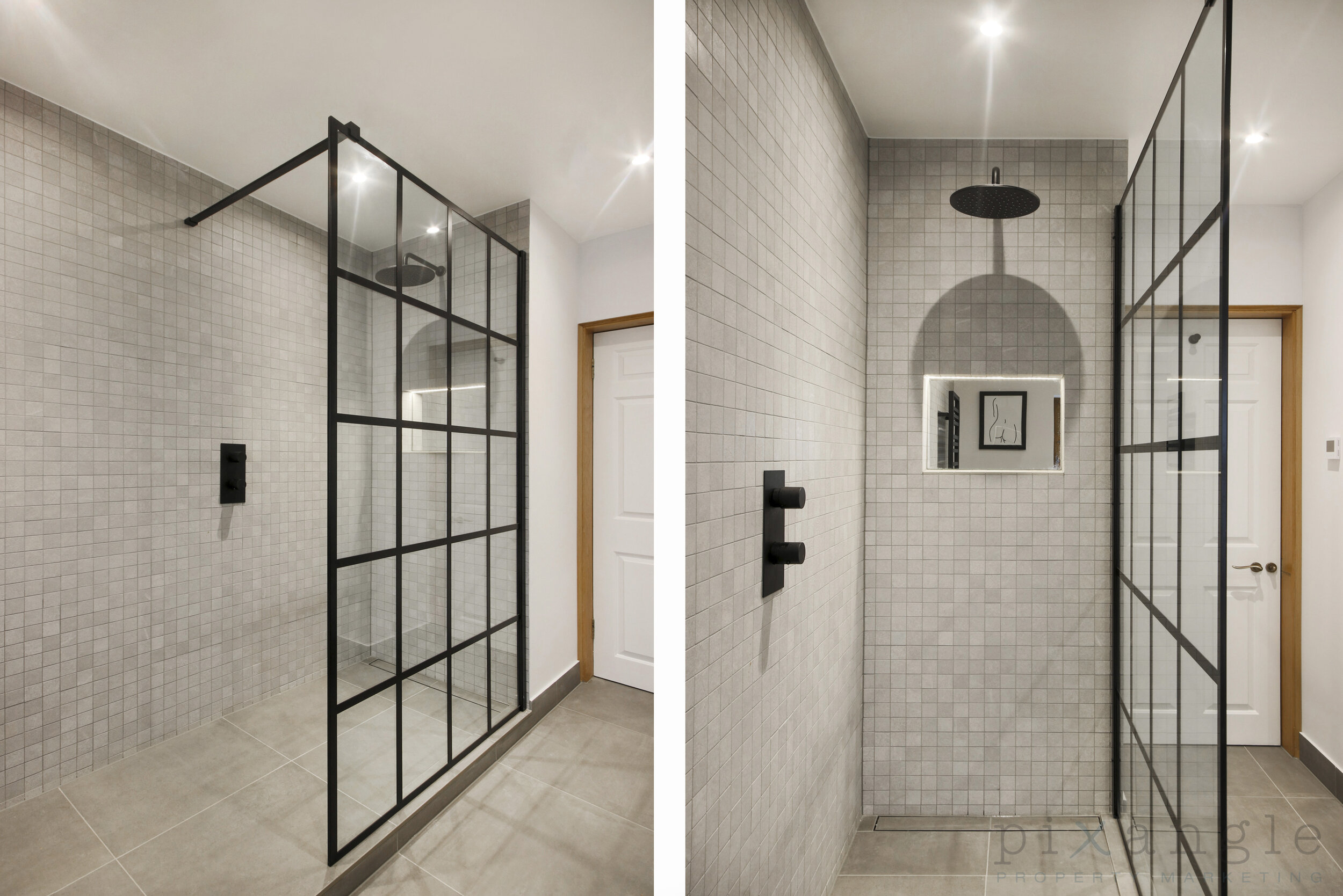
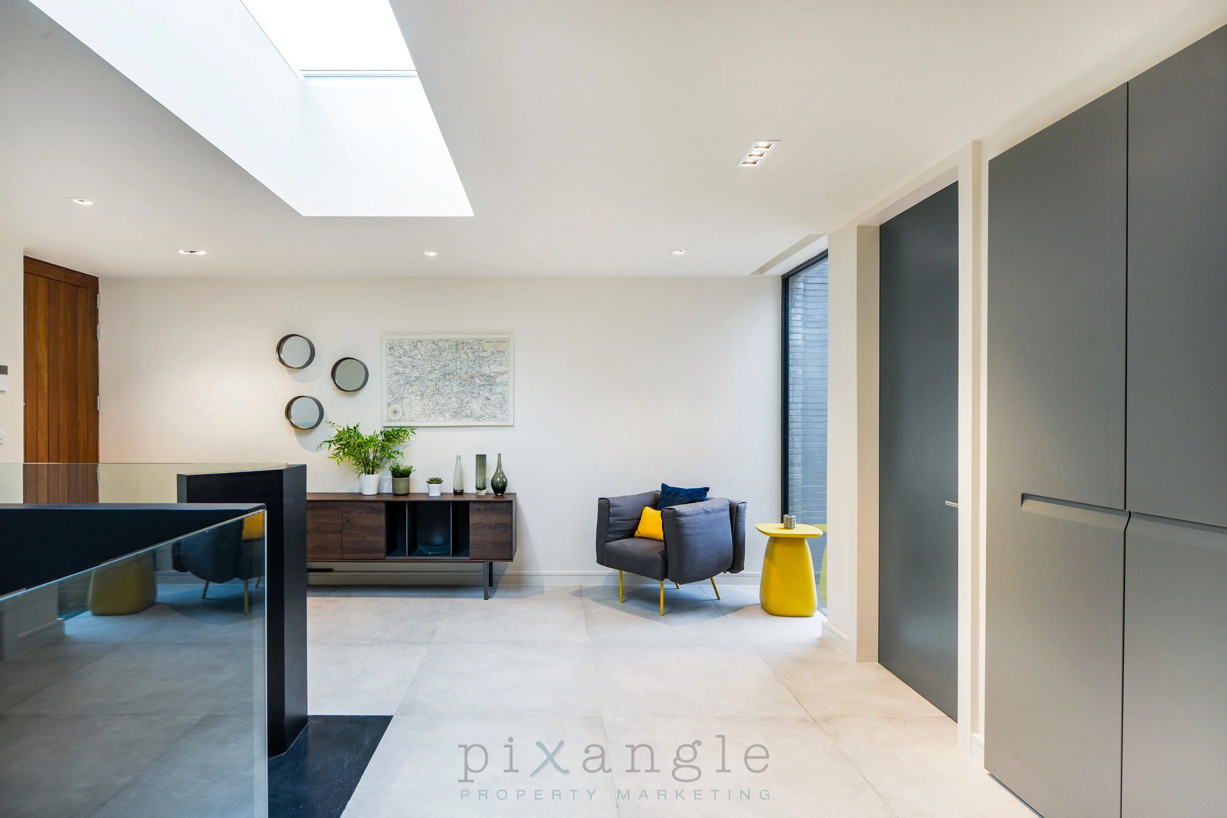
Oooh, love a bit of a minimalist monochrome. This bathroom has really clean lines thanks to its black gridded shower screen, mirrored in the window and complemented by the accents such as the taps and picture frames. It has a nicely geometric feel which we enjoyed shooting.

Just very pleasing!

Just very pleasing!

The details are simple but effective

The details are simple but effective

Birch House Ph25 logo.jpg

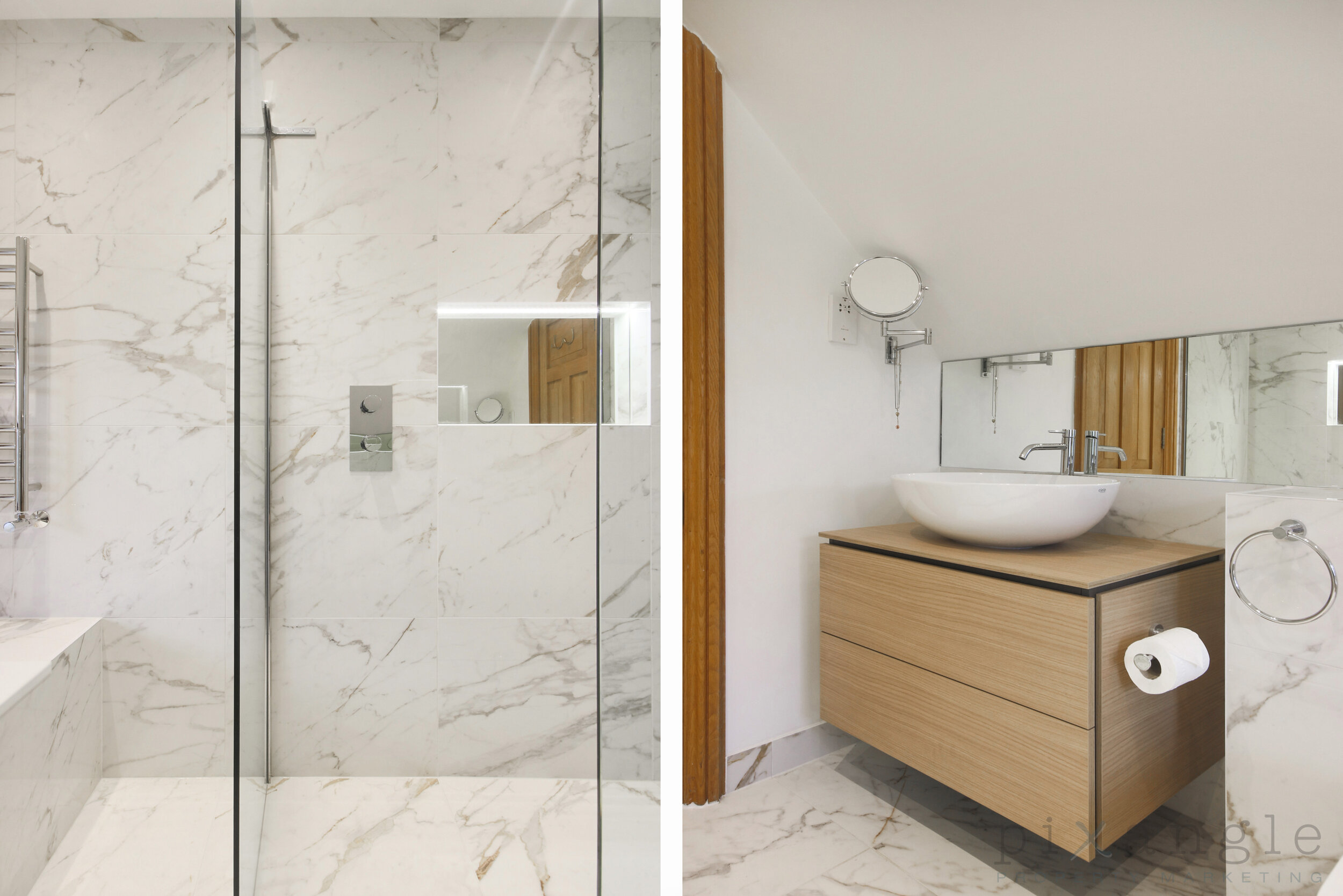
Same property but a completely different vibe, with warm tones and a judicious use of marble. We are also huge fans of making use of reduced height ceiling space, and the placement of the wash basic and WC does exactly that here.

A closer look at the details: Light, natural woods off-set by marbling on floor and walls, and a very clean and simple walk-in shower.

A closer look at the details: Light, natural woods off-set by marbling on floor and walls, and a very clean and simple walk-in shower.

Birch House Ph26 logo.jpg

The third bathroom in this property, the use of reduced height ceiling space is also excellent, particularly directing one end of the bathtub towards the lowest part of the sloping ceiling. We love the use of plants to emphasise the space’s natural feeling.

Built in shelving and storage is always a win.

Built in shelving and storage is always a win.

And a look from the other direction!

And a look from the other direction!

The walk-in rain shower highlights the other metallic decorative touches added to the room

The walk-in rain shower highlights the other metallic decorative touches added to the room

Burpham Lane 25, GU4 - PH04 logo.jpg

Our next shoot with Belgravia Prestige used plenty of built in lighting to illuminate the marble. The greys, whites and brightness of the room create a welcoming environment.

Let’s get a little closer…

Let’s get a little closer…

And even closer to check out the built in illumination, with a beautiful little alcove to hold some decorative detail.

And even closer to check out the built in illumination, with a beautiful little alcove to hold some decorative detail.

Kingsford Street 22-24 PH4 logo.jpg

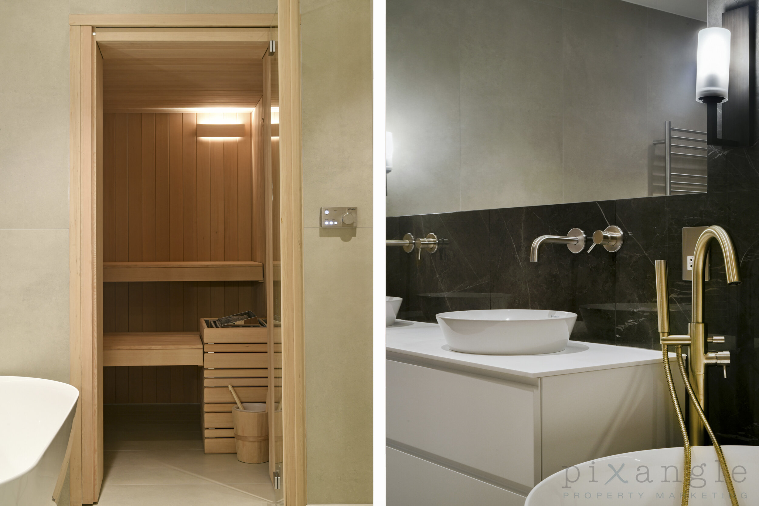
This shoot, in Belsize Park, gave us bold, dark colours to work with, in contrast to the smooth lines of the white bathroom furniture. The large mirror makes the room feel even more spacious, and we love the double sinks.

The elegance of the simplicity is beautiful to shoot

The elegance of the simplicity is beautiful to shoot

And don’t forget the sauna! Tucked away and making use of traditional natural materials, it’s a lovely addition to the room.

And don’t forget the sauna! Tucked away and making use of traditional natural materials, it’s a lovely addition to the room.

Ladbroke Grove 78, W11 - PH33 logo.jpg

Look at this beautiful bathroom! The metal furnishings are a beautiful burnished brass to reflect the warm tones of the walls, and the slim black lines exhibited in the mirror and shower provide crispness in the overall look.

Another angle to demonstrate the excellent use of space

Another angle to demonstrate the excellent use of space

Yester Park, Southcroft, BR7 - PH02 logo.jpg

This shoot gave us greys and whites to focus on, with some great features coming up…

An entire section of wall devoted to a walk in shower!

An entire section of wall devoted to a walk in shower!

Sleek bathroom fixtures

Sleek bathroom fixtures

A heated towel rail that blends perfectly with the decor

A heated towel rail that blends perfectly with the decor

This mirrored cabinet with built in lighting provides a nice feature reflecting the shower behind.

This mirrored cabinet with built in lighting provides a nice feature reflecting the shower behind.

Westbourne Park Road 64, W2 - PH20 logo.jpg

And a bonus image from another shoot because, well, look at it! The serenity. Just beautiful. Well done, Belgravia Prestige!

Prepping Your Home For A Property Photographer

One thing our clients get asked a lot from their vendors and landlords is how shall I prepare for the visit from the photographer? How can I make sure my property is ready to look its best for the shoot?

This question has never been more important, as in these current times we are not able to touch and move people’s personal belongings, and even under normal circumstances we have limited time to do so. This means that the more prep you can do to ensure your property is camera-ready, the better the photos will look to prospective buyers and renters.

So we’ve put together a guide to getting your property ready for the visit from the photographer! We hope you find it useful, and may your property sell/rent quickly and well!

1.       Clean, clear and tidy

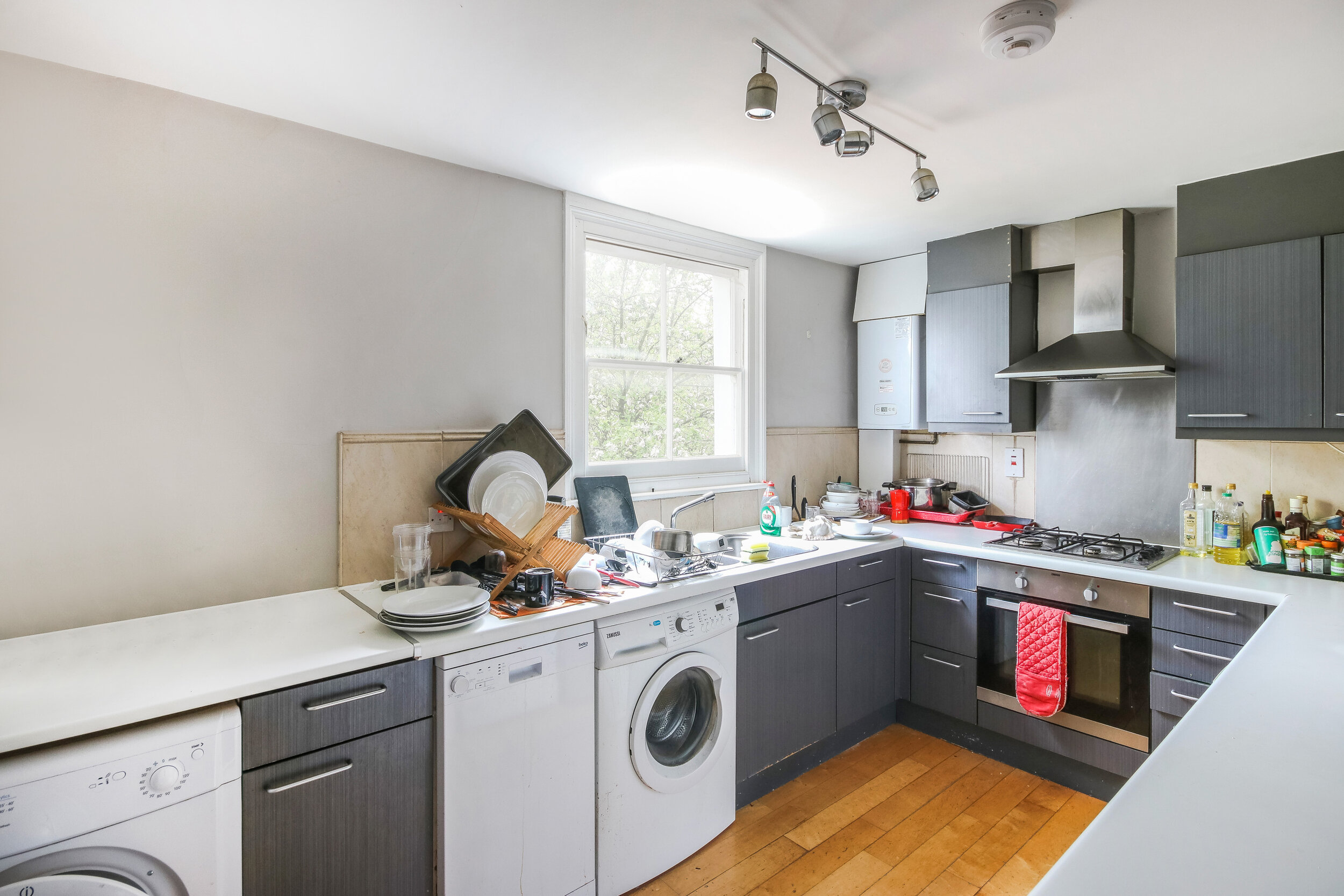
This is the big one. When prospective buyers/renters look at a property, they do not want to see all your stuff. They want to be able to see the space, and envisage what it would be like to live there. So it’s best if you can clear all the surfaces as much as possible and tidy everything away. Big things that look more obvious than you’d think are rubbish/recycling bins and boxes on tops of wardrobes and cabinets. Smaller things are washing up liquid and sponges on kitchen sinks, or tea-towels on ovens.

Unfortunately if there is this much clutter on the surfaces, there is little we can do to edit it out

Unfortunately if there is this much clutter on the surfaces, there is little we can do to edit it out

Henry Doulton Drive 151 - Ph6.jpg
We were able to do some edit on this one - the surfaces look so much better.

We were able to do some edit on this one - the surfaces look so much better.

2.       Bathrooms

Nothing makes a bathroom look more cluttered in a photo than bottles of toiletries. They really draw the eye. These should be moved out of the room if possible, or even just put in the bottom of the bathtub as the camera is unlikely to catch sight of them there. Likewise, implements like loo brushes or bottles of bleach aren’t really what people want to be thinking about as they ponder whether they’d like to use this bathroom. In general, the emptier the better – though if you have beautifully colour coordinated hand wash and cream then by all means show them off!

Sky Gardens 2706 Ph3 no cloning.jpg
Not a big change, but makes a huge difference

Not a big change, but makes a huge difference

3.       Pets

We adore pets here at Pixangle. It’s even an interview question: Do you like dogs? But it’s best if no trace of your family floofs end up in the shots, particularly food bowls and toys. The people looking at your home may have allergies, or they just might not be pet people, and you don’t want to immediately turn them off.

See it yet?

See it yet?

Don’t mind me.

Don’t mind me.

4.       Curtains

Here’s one that would never occur to you but makes a huge difference: Please take down your net curtains. We promise the shot will look better for it. Other points in this area are black out blinds on children’s windows (vital for sleeping babies, but a very quick way to make a room look like a prison), broken curtains or blinds, and, weirdly, shower curtains that you can’t tuck away to hang neatly at the wall.

They were stuck like this, unfortunately.

They were stuck like this, unfortunately.

It would have been really nice to see out of these windows!

It would have been really nice to see out of these windows!

The shower curtain really draws the eye and looks untidy.

The shower curtain really draws the eye and looks untidy.

Net curtains can often make the frames behind them look dirty due to the shadows.

Net curtains can often make the frames behind them look dirty due to the shadows.

5.       Personal items

The nude pregnancy shoot was beautiful and empowering, and it’s lovely to have blown up photos of your kids all over the house, but you never really realise how prominent they are until you see them in marketing shots on the internet. We can blur photos, but it’s best to take them down for the visit if you can.

Just a bit distracting…

Just a bit distracting…

Before…

Before…

After!

After!

6.       Wardrobe doors closed

A niche one, but wardrobe and cupboard doors left even slightly ajar look really untidy and unbalance the lines of the shot. Double the effect if there are pieces of clothes sticking out. A quick and easy fix, and worth prepping in advance.

All done in editing, this one, but not something that we do routinely, so it’s very helpful if this sort of thing is done in advance.

All done in editing, this one, but not something that we do routinely, so it’s very helpful if this sort of thing is done in advance.

7.       Gardens

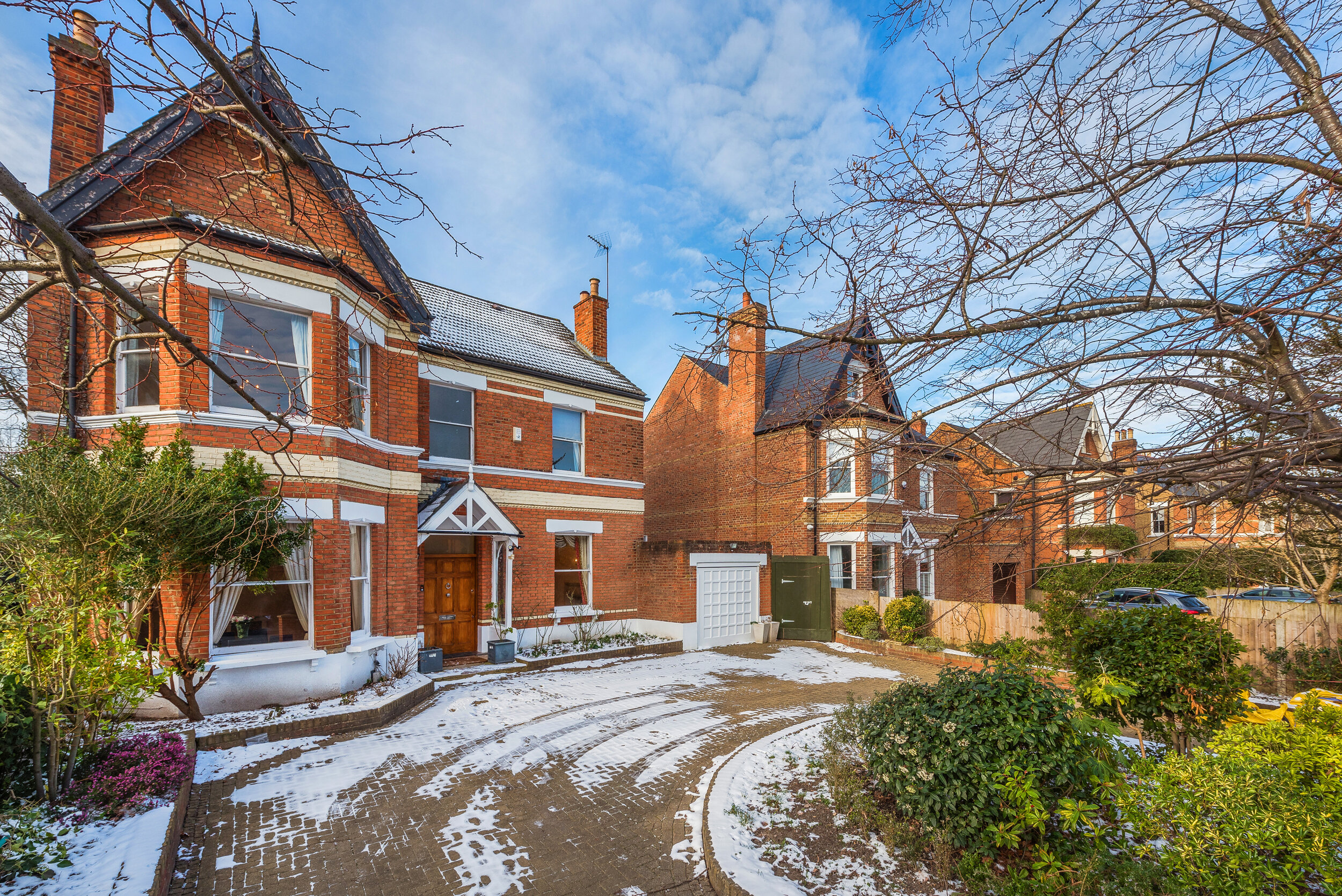
In the delightful climate of the UK, we are somewhat at the mercy of the weather and the seasons. That being said, it is always best if you can take covers off garden furniture (even if it’s raining), and put up parasols. Washing lines should be collapsed if possible and there really shouldn’t be any clothes on it! And finally, if you managed to have a photographer visit on one of the very few days of the year on which there’s snow about, do ask your agent to request the photographer returns as soon as it’s cleared to reshoot the externals. Aside from Christmas trees, few things date property marketing shots as much as snow.

Ominous.

Ominous.

A drier day, a different angle, and voila

A drier day, a different angle, and voila

Festive!

Festive!

Timeless.

Timeless.

8.       Cars

If you possibly can, it’s worth getting your car off the driveway for the shoot. They take up an enormous amount of the image, and distract from the exterior of the property.

Um…

Um…

Better!

Better!

And it really can be VERY dominant.

And it really can be VERY dominant.

9.       Cushions, pillows and bedding

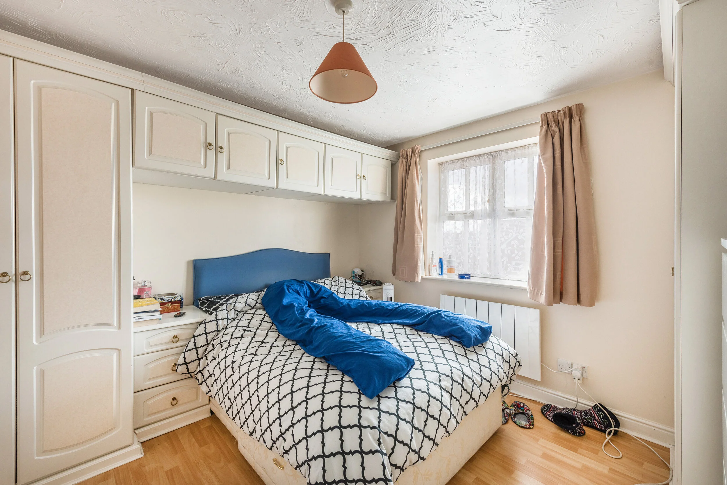
We can all agree that an unmade bed is not going to look good, but it’s surprising how often we’re asked to edit out wrinkles in the duvet! It’s worth looking twice at how your bed’s made before the photographer shows up, and if the pillows are straight and look appealing. Likewise, it’s good to give your cushions a good thump and place them deliberately on sofas and beds rather than having them flattened from your Game of Thrones binge and strewn around.

Whyyyy

Whyyyy

This is all editing - we built a cushion to make this situation more appealing.

This is all editing - we built a cushion to make this situation more appealing.

And this is how nice it can look!

And this is how nice it can look!

10.       Nice touches

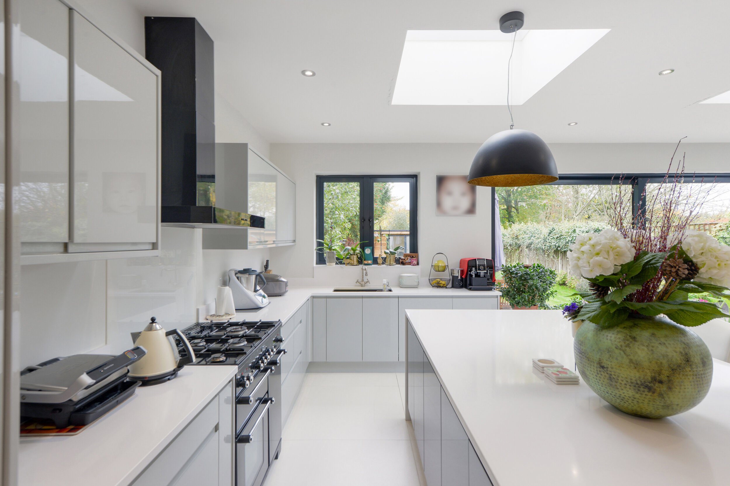
And if you have a little extra time and are invested in showing your property in its best light, vases of flowers and healthy house plants inject a bit of life and colour into a room, and are a lovely addition to marketing shots.

Look at the beautiful balance of the corner plants, and the flowers add a nice touch to the table

Look at the beautiful balance of the corner plants, and the flowers add a nice touch to the table

Fruit AND flowers! Bonus.

Fruit AND flowers! Bonus.

This is such a beautiful kitchen and the owners did a lovely job presenting it

This is such a beautiful kitchen and the owners did a lovely job presenting it

Seen from another angle, the plants really complement the green units and natural wood worktops

Seen from another angle, the plants really complement the green units and natural wood worktops

We hope that this has been helpful if you’re putting your house on the market, and gives you some ideas of how to make your home look its best!