One thing our clients get asked a lot from their vendors and landlords is how shall I prepare for the visit from the photographer? How can I make sure my property is ready to look its best for the shoot?
This question has never been more important, as in these current times we are not able to touch and move people’s personal belongings, and even under normal circumstances we have limited time to do so. This means that the more prep you can do to ensure your property is camera-ready, the better the photos will look to prospective buyers and renters.
So we’ve put together a guide to getting your property ready for the visit from the photographer! We hope you find it useful, and may your property sell/rent quickly and well!
1. Clean, clear and tidy
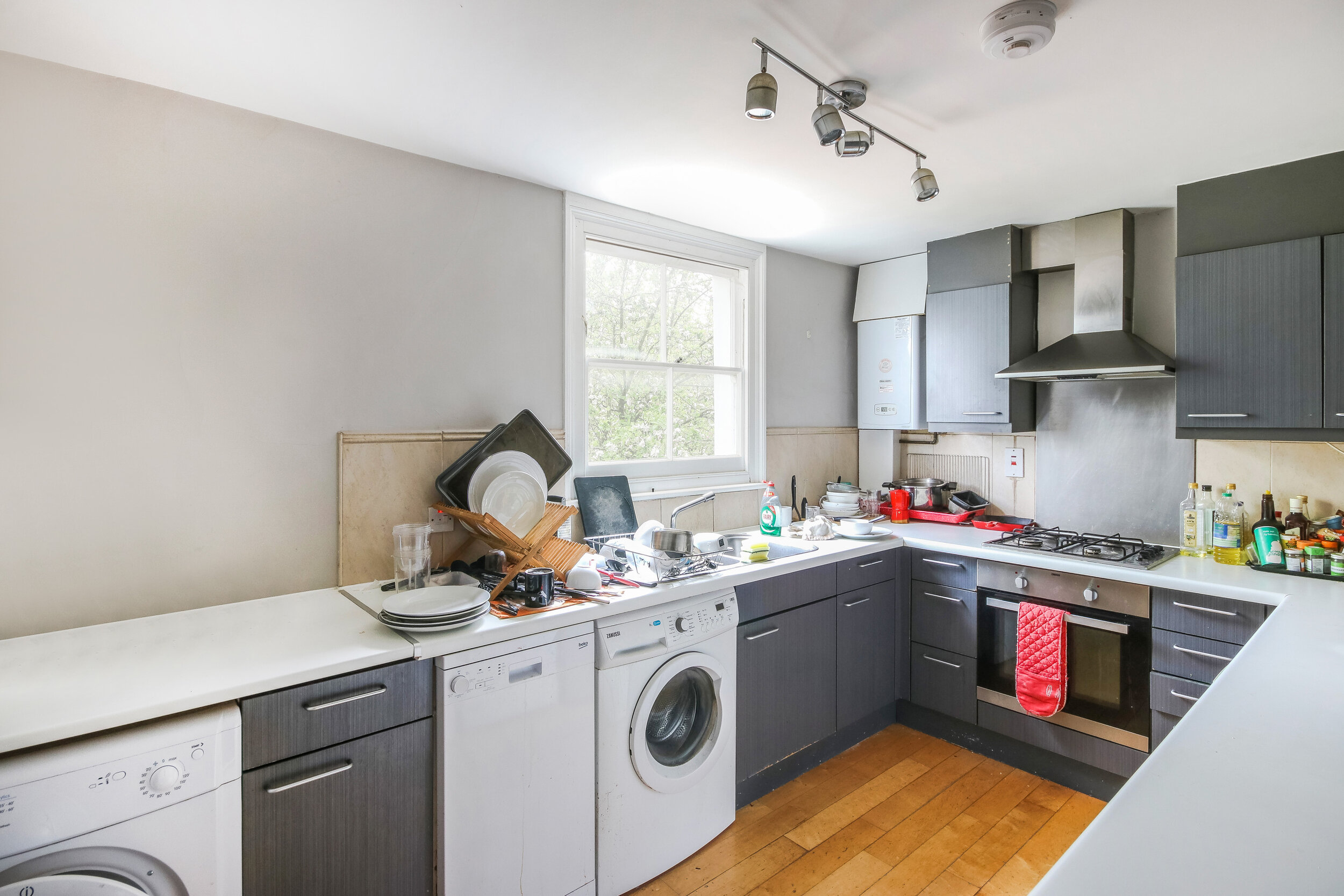
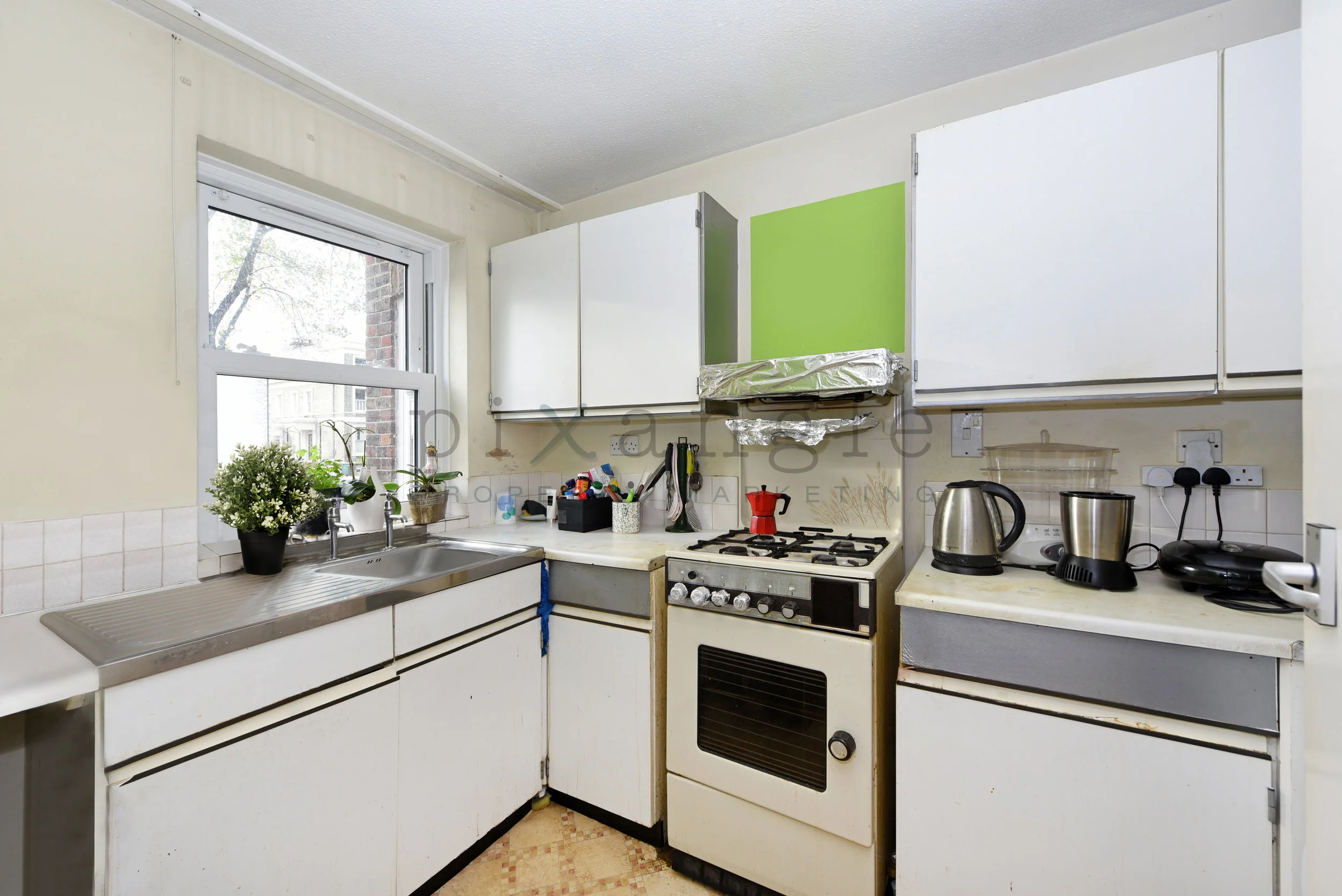
This is the big one. When prospective buyers/renters look at a property, they do not want to see all your stuff. They want to be able to see the space, and envisage what it would be like to live there. So it’s best if you can clear all the surfaces as much as possible and tidy everything away. Big things that look more obvious than you’d think are rubbish/recycling bins and boxes on tops of wardrobes and cabinets. Smaller things are washing up liquid and sponges on kitchen sinks, or tea-towels on ovens.
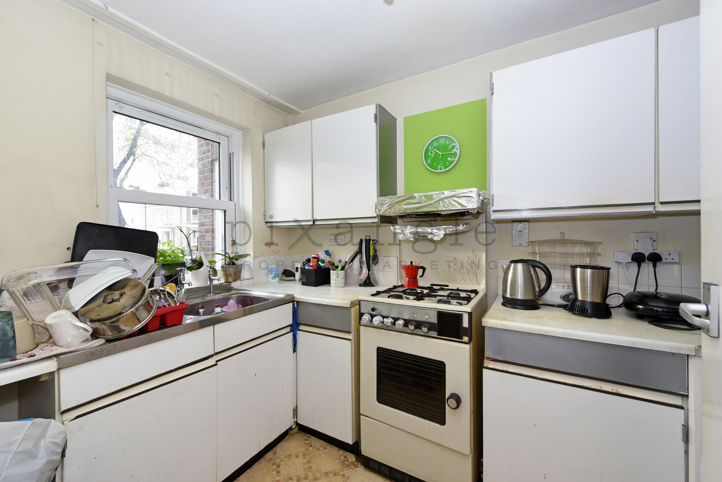
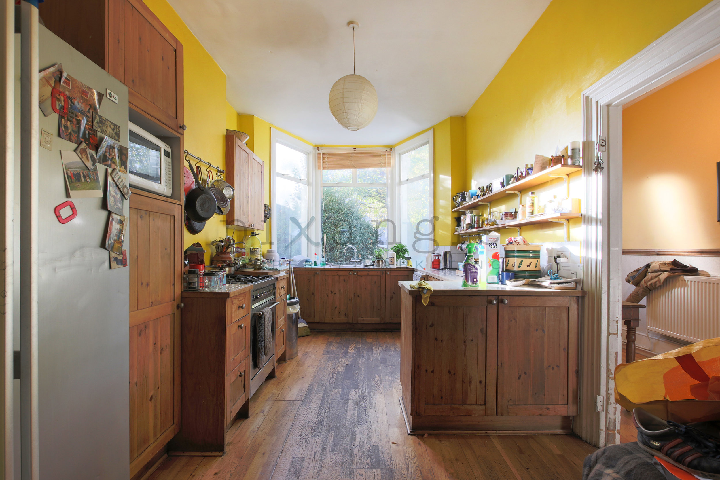
Unfortunately if there is this much clutter on the surfaces, there is little we can do to edit it out
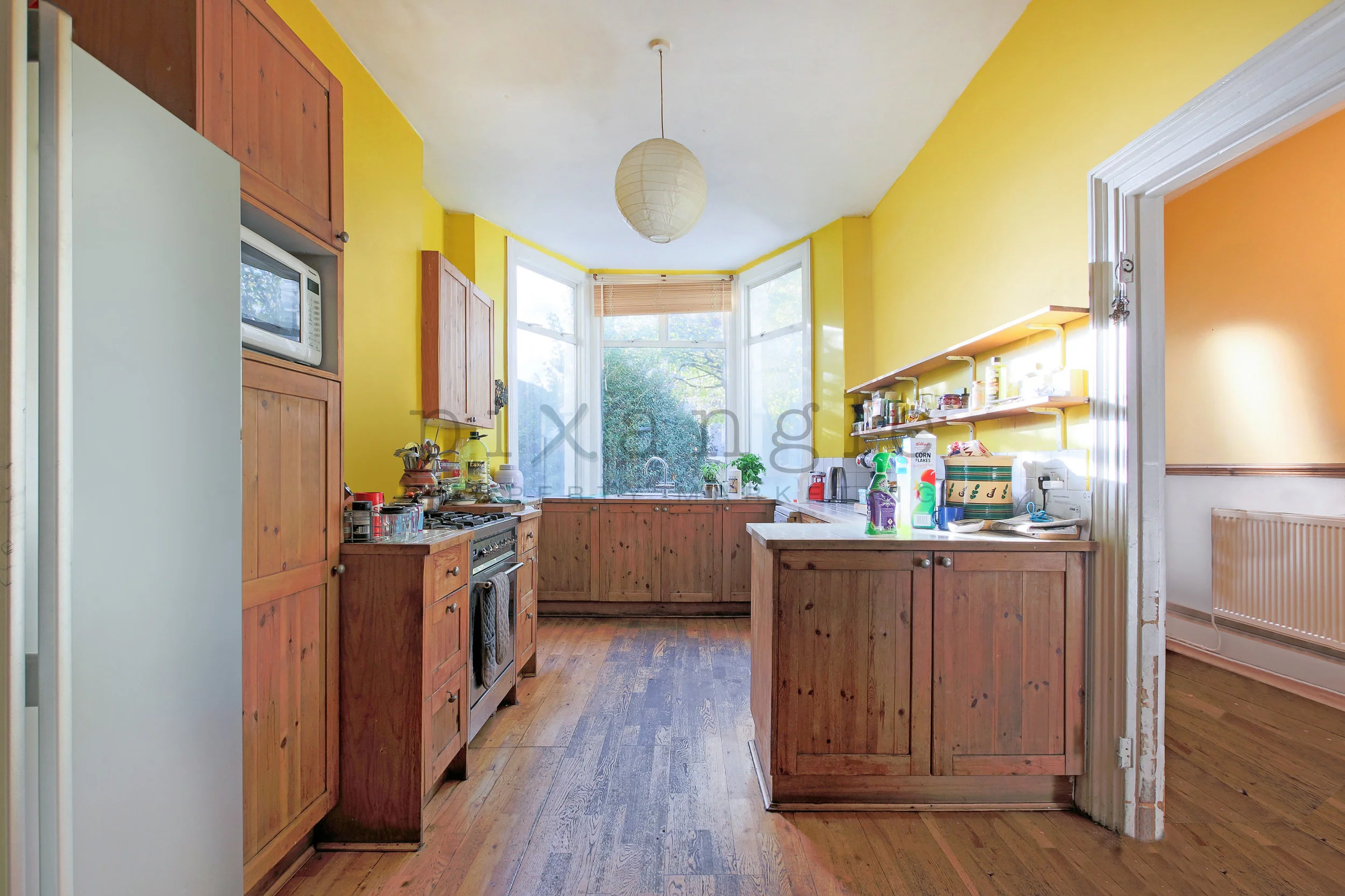
We were able to do some edit on this one - the surfaces look so much better.
2. Bathrooms
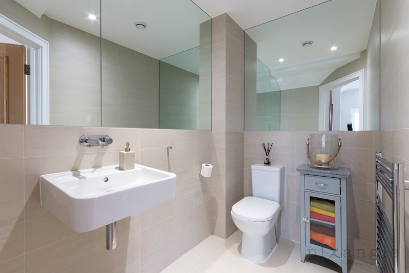
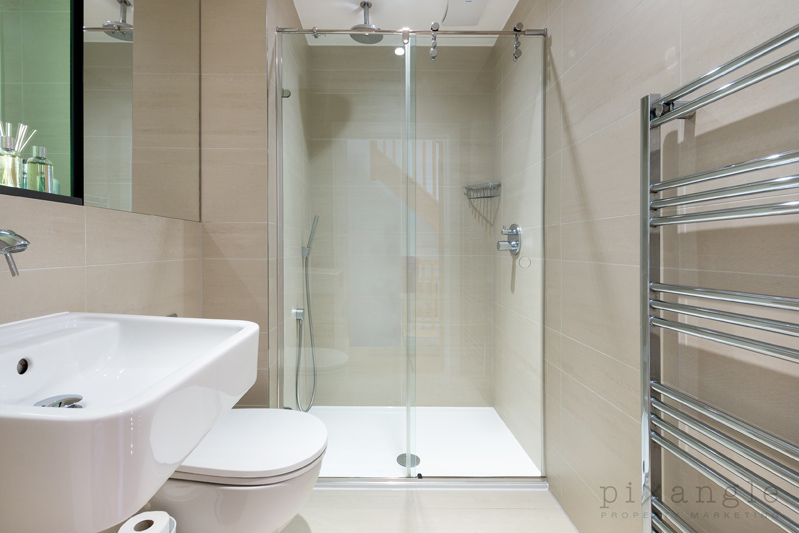
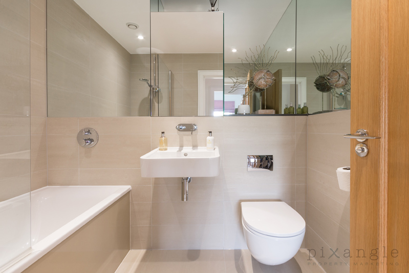
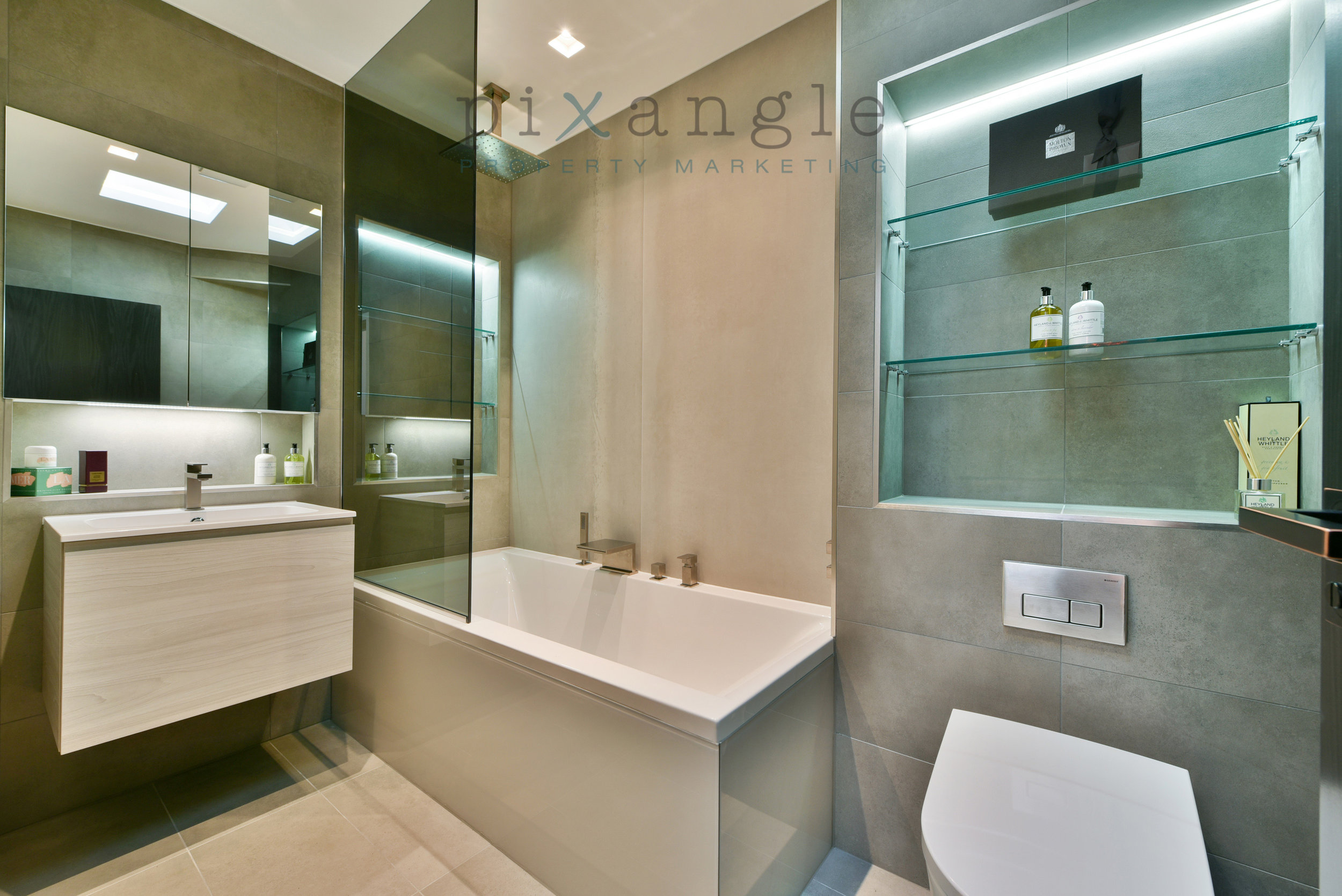
Nothing makes a bathroom look more cluttered in a photo than bottles of toiletries. They really draw the eye. These should be moved out of the room if possible, or even just put in the bottom of the bathtub as the camera is unlikely to catch sight of them there. Likewise, implements like loo brushes or bottles of bleach aren’t really what people want to be thinking about as they ponder whether they’d like to use this bathroom. In general, the emptier the better – though if you have beautifully colour coordinated hand wash and cream then by all means show them off!
Not a big change, but makes a huge difference
3. Pets
We adore pets here at Pixangle. It’s even an interview question: Do you like dogs? But it’s best if no trace of your family floofs end up in the shots, particularly food bowls and toys. The people looking at your home may have allergies, or they just might not be pet people, and you don’t want to immediately turn them off.
See it yet?
Don’t mind me.
4. Curtains
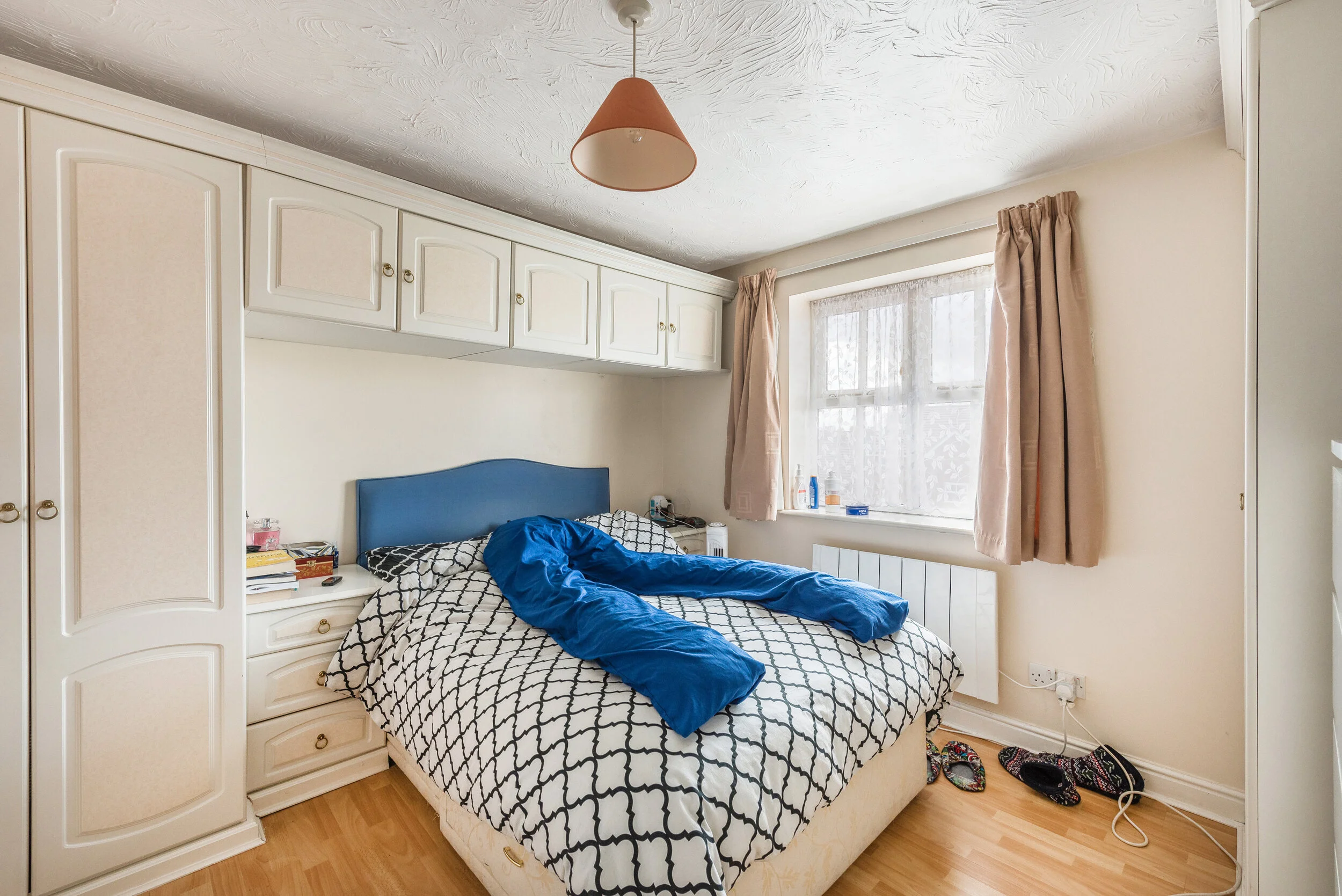
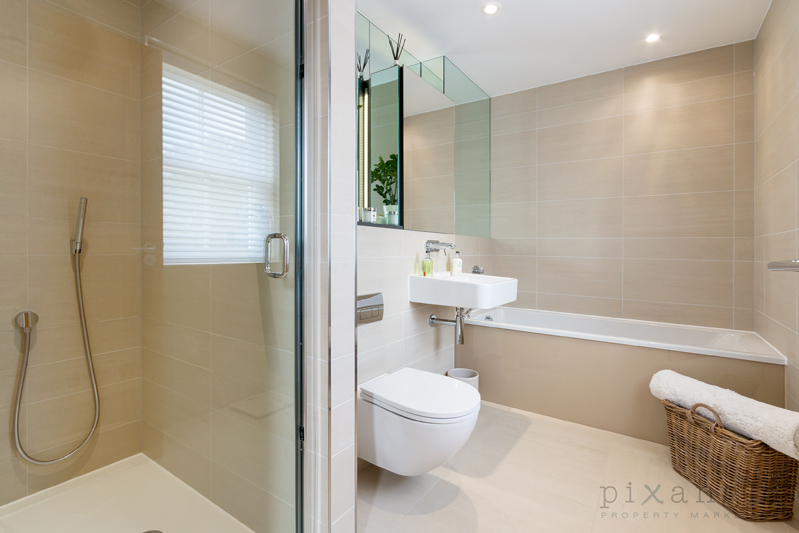
Here’s one that would never occur to you but makes a huge difference: Please take down your net curtains. We promise the shot will look better for it. Other points in this area are black out blinds on children’s windows (vital for sleeping babies, but a very quick way to make a room look like a prison), broken curtains or blinds, and, weirdly, shower curtains that you can’t tuck away to hang neatly at the wall.
They were stuck like this, unfortunately.
It would have been really nice to see out of these windows!
The shower curtain really draws the eye and looks untidy.
Net curtains can often make the frames behind them look dirty due to the shadows.
5. Personal items
The nude pregnancy shoot was beautiful and empowering, and it’s lovely to have blown up photos of your kids all over the house, but you never really realise how prominent they are until you see them in marketing shots on the internet. We can blur photos, but it’s best to take them down for the visit if you can.
Just a bit distracting…
Before…
After!
6. Wardrobe doors closed
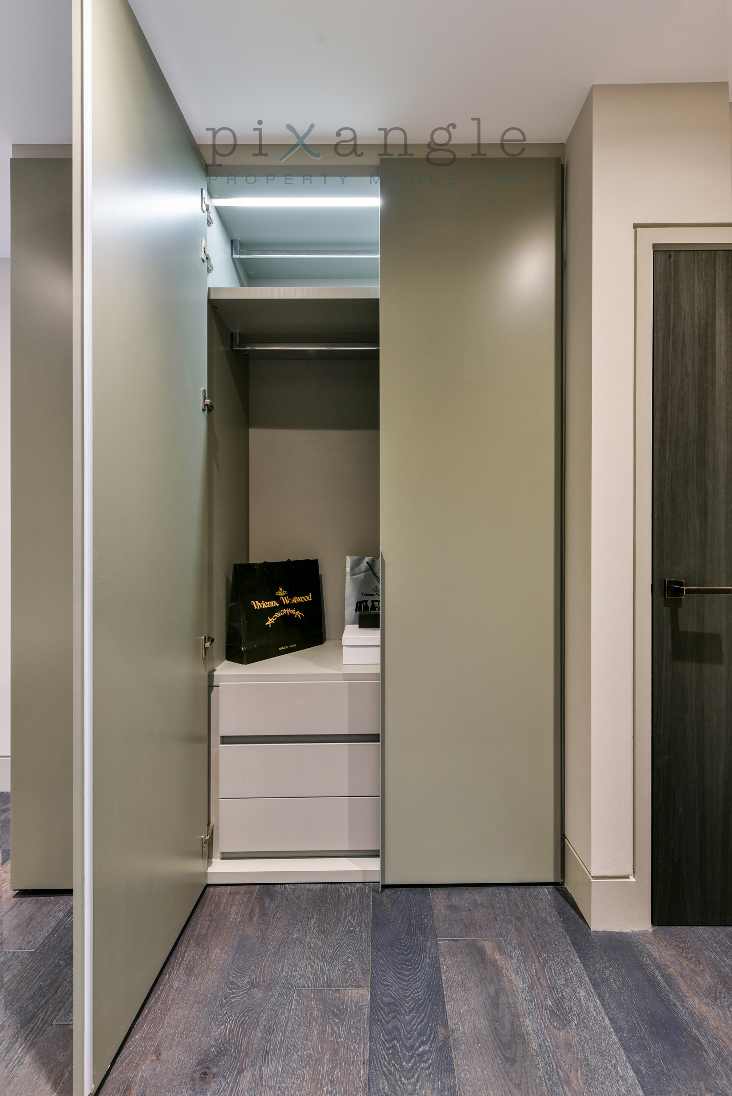
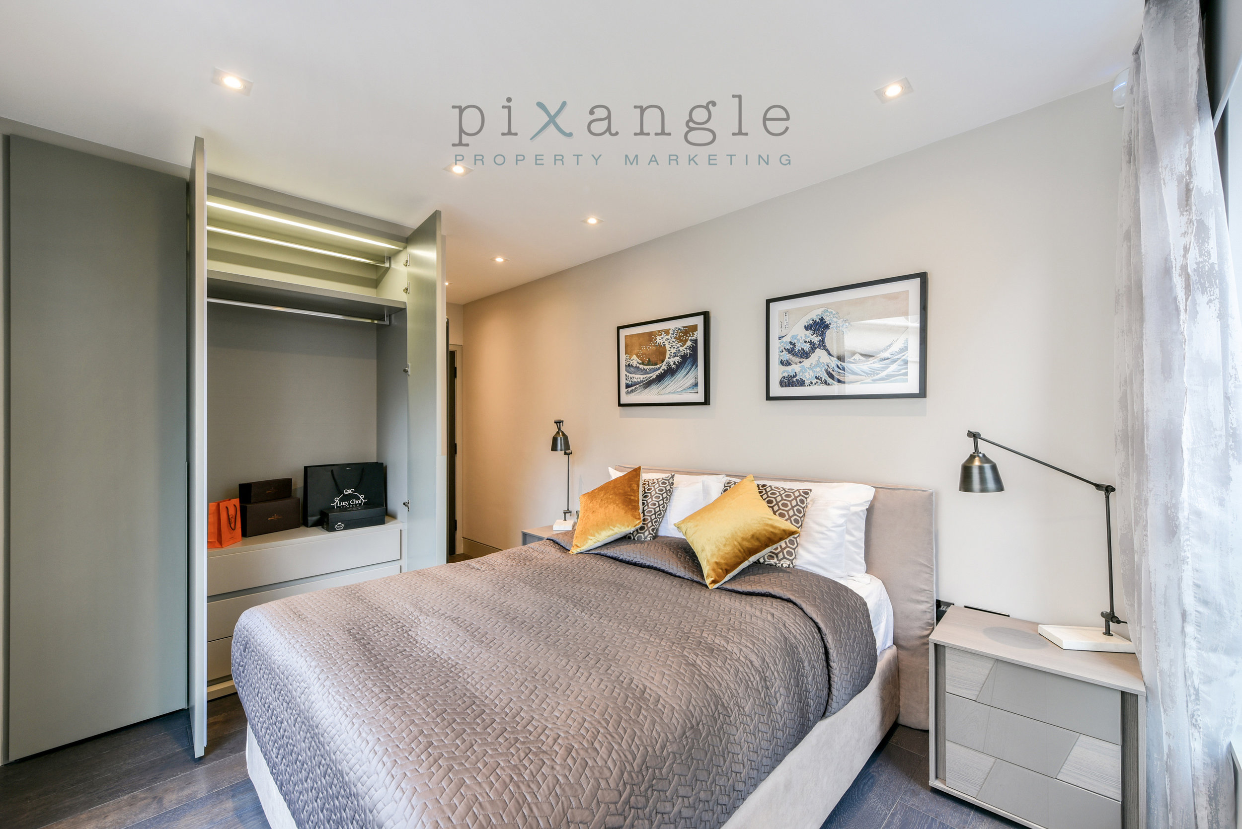
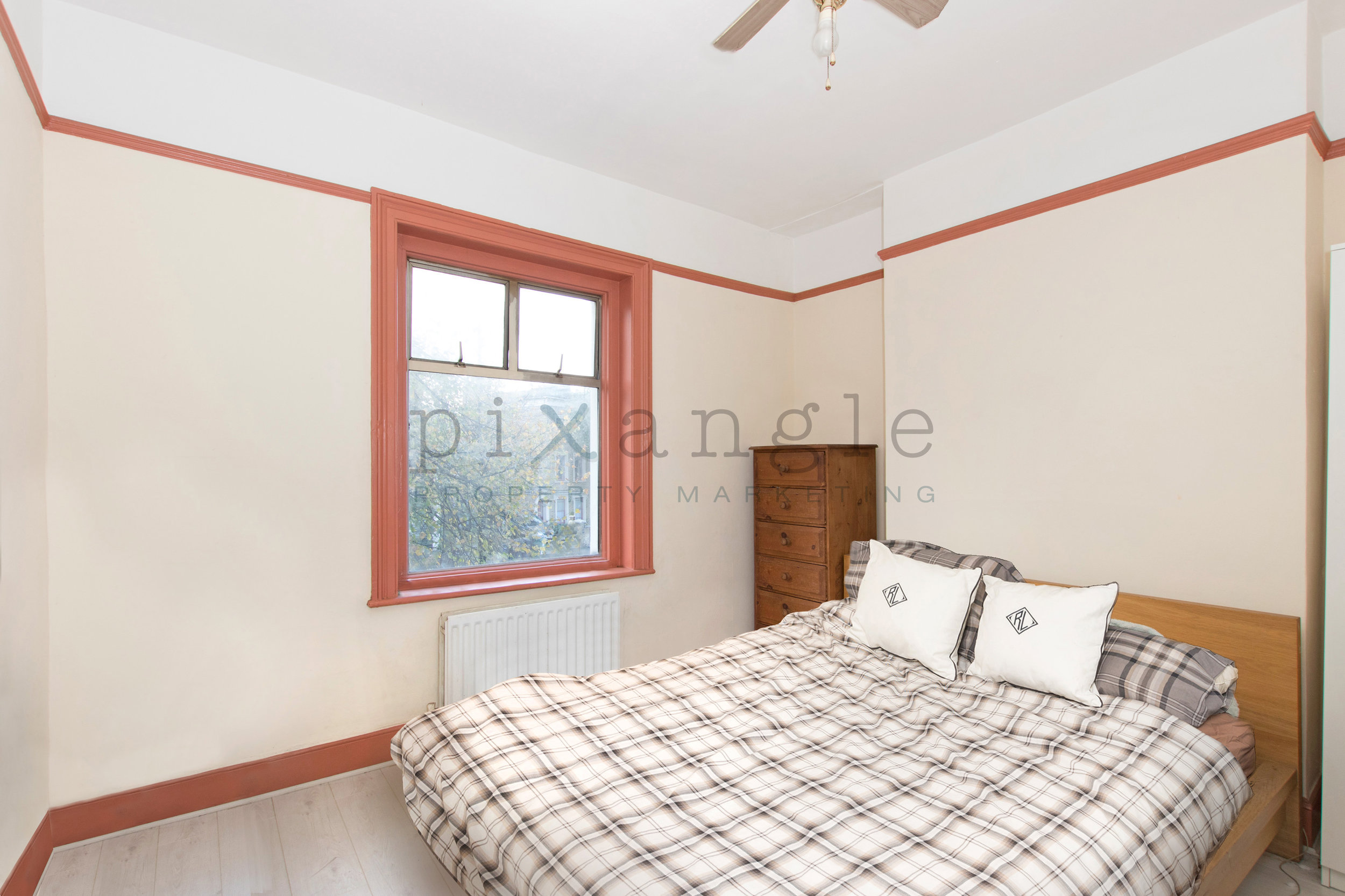
A niche one, but wardrobe and cupboard doors left even slightly ajar look really untidy and unbalance the lines of the shot. Double the effect if there are pieces of clothes sticking out. A quick and easy fix, and worth prepping in advance.
All done in editing, this one, but not something that we do routinely, so it’s very helpful if this sort of thing is done in advance.
7. Gardens
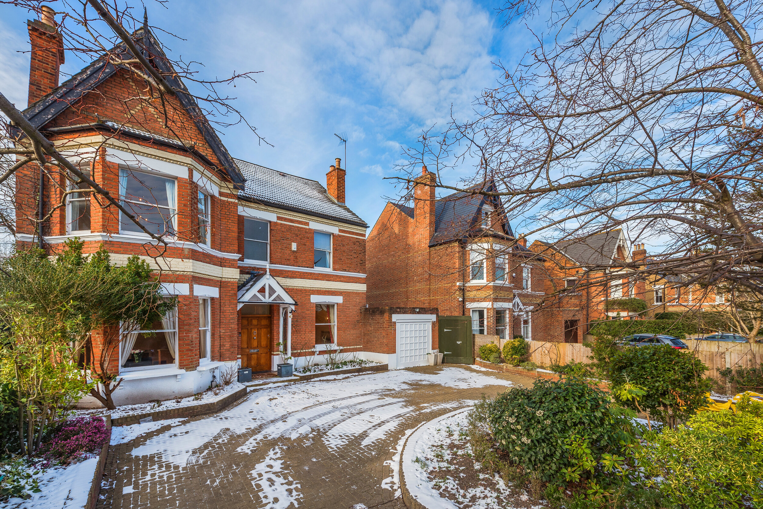
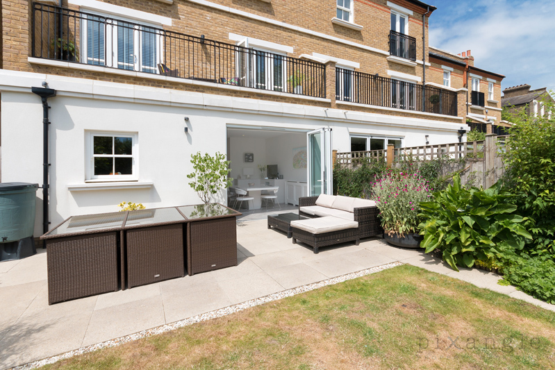
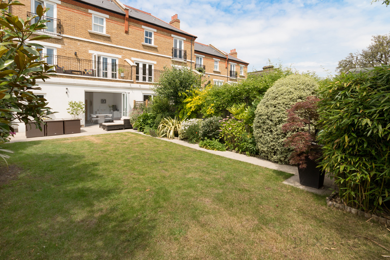
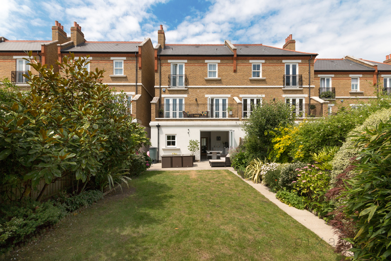
In the delightful climate of the UK, we are somewhat at the mercy of the weather and the seasons. That being said, it is always best if you can take covers off garden furniture (even if it’s raining), and put up parasols. Washing lines should be collapsed if possible and there really shouldn’t be any clothes on it! And finally, if you managed to have a photographer visit on one of the very few days of the year on which there’s snow about, do ask your agent to request the photographer returns as soon as it’s cleared to reshoot the externals. Aside from Christmas trees, few things date property marketing shots as much as snow.
Ominous.
A drier day, a different angle, and voila
Festive!
Timeless.
8. Cars
If you possibly can, it’s worth getting your car off the driveway for the shoot. They take up an enormous amount of the image, and distract from the exterior of the property.
Um…
Better!
And it really can be VERY dominant.
9. Cushions, pillows and bedding
We can all agree that an unmade bed is not going to look good, but it’s surprising how often we’re asked to edit out wrinkles in the duvet! It’s worth looking twice at how your bed’s made before the photographer shows up, and if the pillows are straight and look appealing. Likewise, it’s good to give your cushions a good thump and place them deliberately on sofas and beds rather than having them flattened from your Game of Thrones binge and strewn around.
Whyyyy
This is all editing - we built a cushion to make this situation more appealing.
And this is how nice it can look!
10. Nice touches
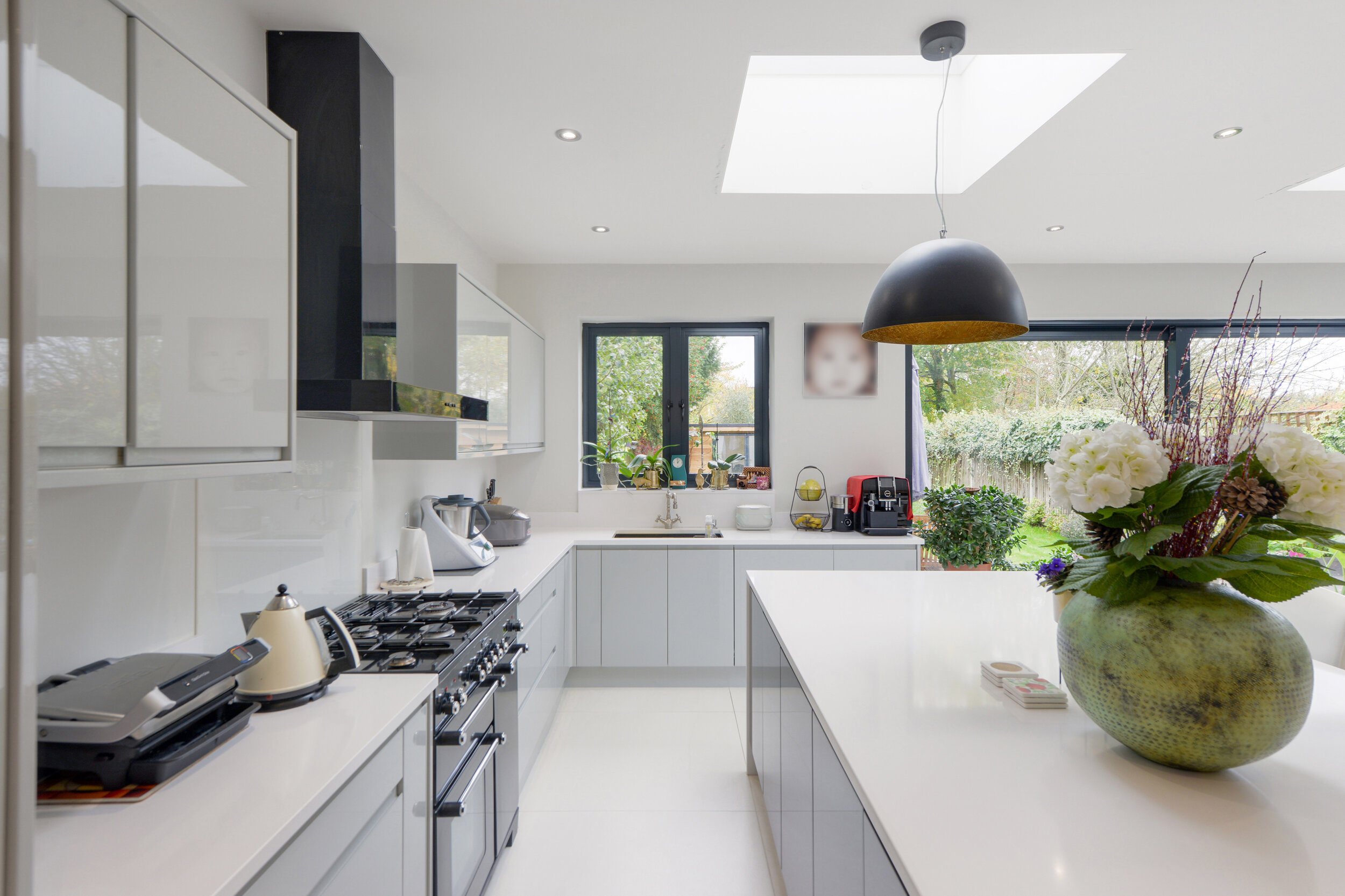
And if you have a little extra time and are invested in showing your property in its best light, vases of flowers and healthy house plants inject a bit of life and colour into a room, and are a lovely addition to marketing shots.
Look at the beautiful balance of the corner plants, and the flowers add a nice touch to the table
Fruit AND flowers! Bonus.
This is such a beautiful kitchen and the owners did a lovely job presenting it
Seen from another angle, the plants really complement the green units and natural wood worktops
We hope that this has been helpful if you’re putting your house on the market, and gives you some ideas of how to make your home look its best!

